15 Bedroom Accent Wall Ideas That Feel Modern and Timeless
15 Bedroom Accent Wall Ideas That Feel Modern and Timeless
The wall behind the bed is the first thing seen from the bedroom door and the backdrop in every photograph of the room, yet in most bedrooms it is left as plain painted drywall while all the effort goes into bedding and lamps. A good accent wall fixes that imbalance. It gives the bed a frame, makes plain bedding look deliberate, and lets the whole room feel finished without changing a single piece of furniture.
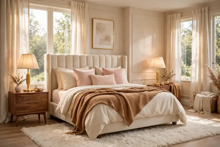
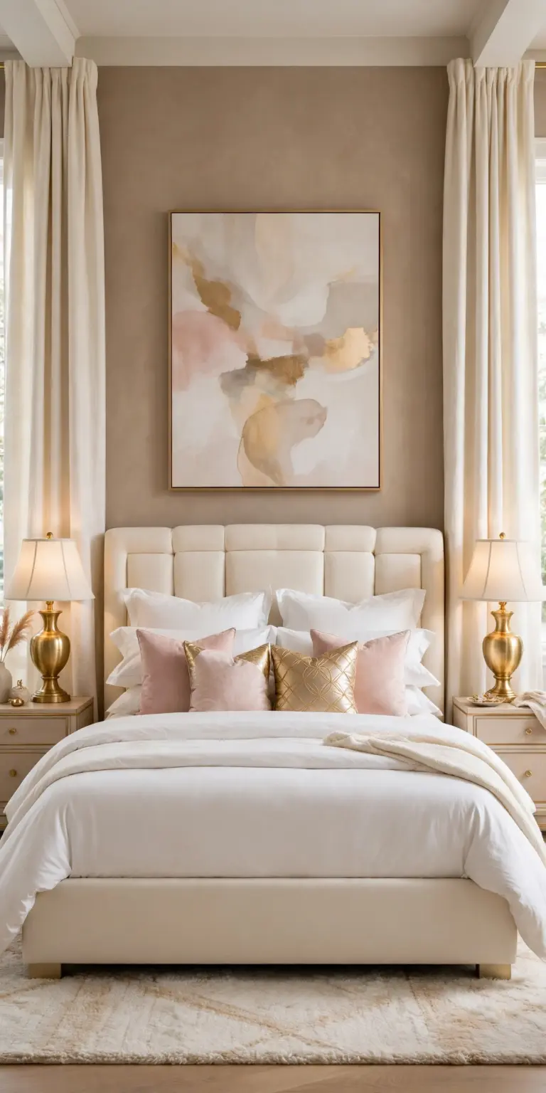
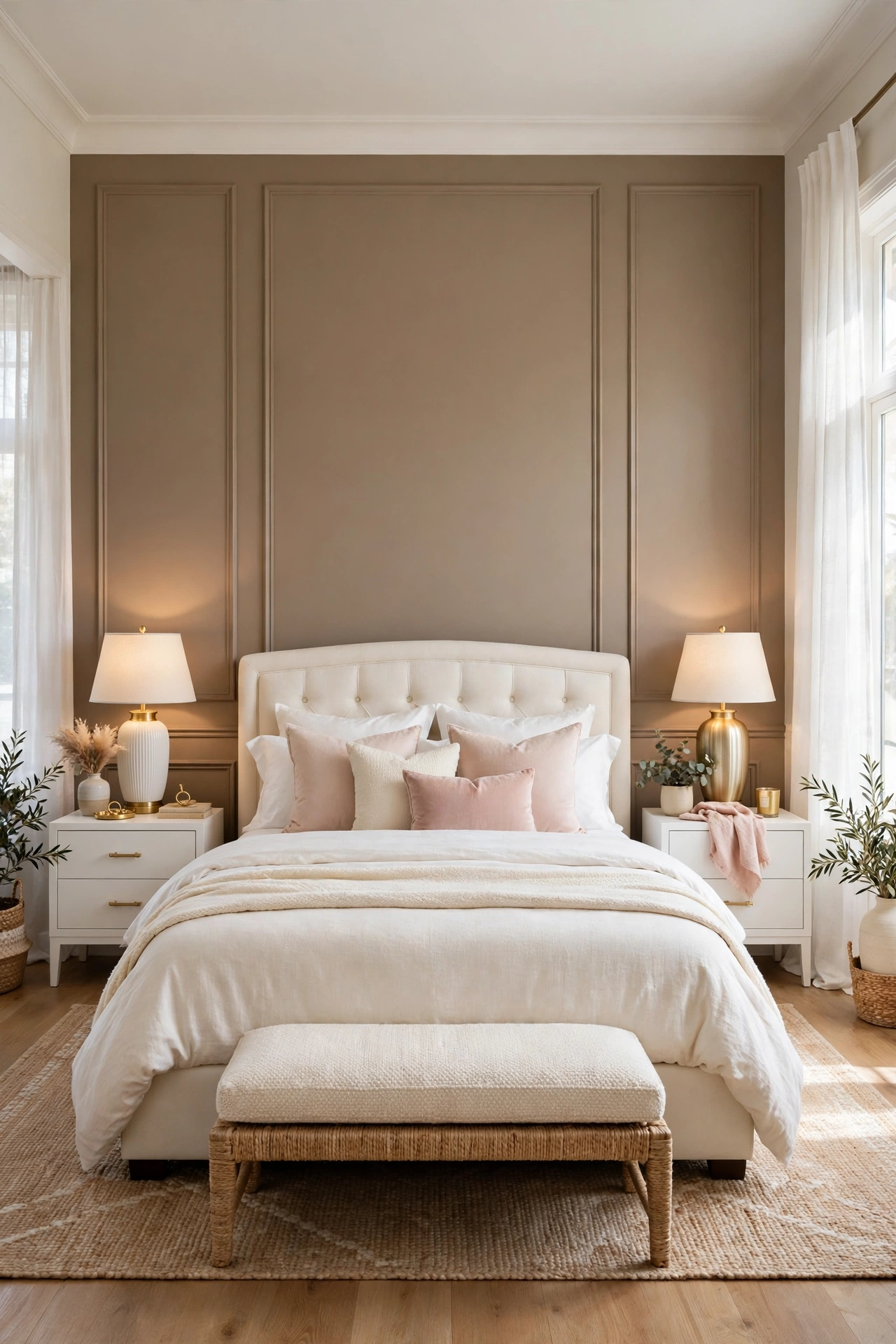
These fifteen bedroom accent wall ideas use one calm glam palette, white, cream, warm taupe, blush pink, and gold, and one bed, an ivory upholstered frame with cream bedding, so the only thing that changes from idea to idea is the wall itself. They run from a single coat of paint to built in panels and plaster, and every one explains why it works, how to do it in the right order, and the mistake that most often ruins it.
1. Warm Taupe Paint, One Calm Color
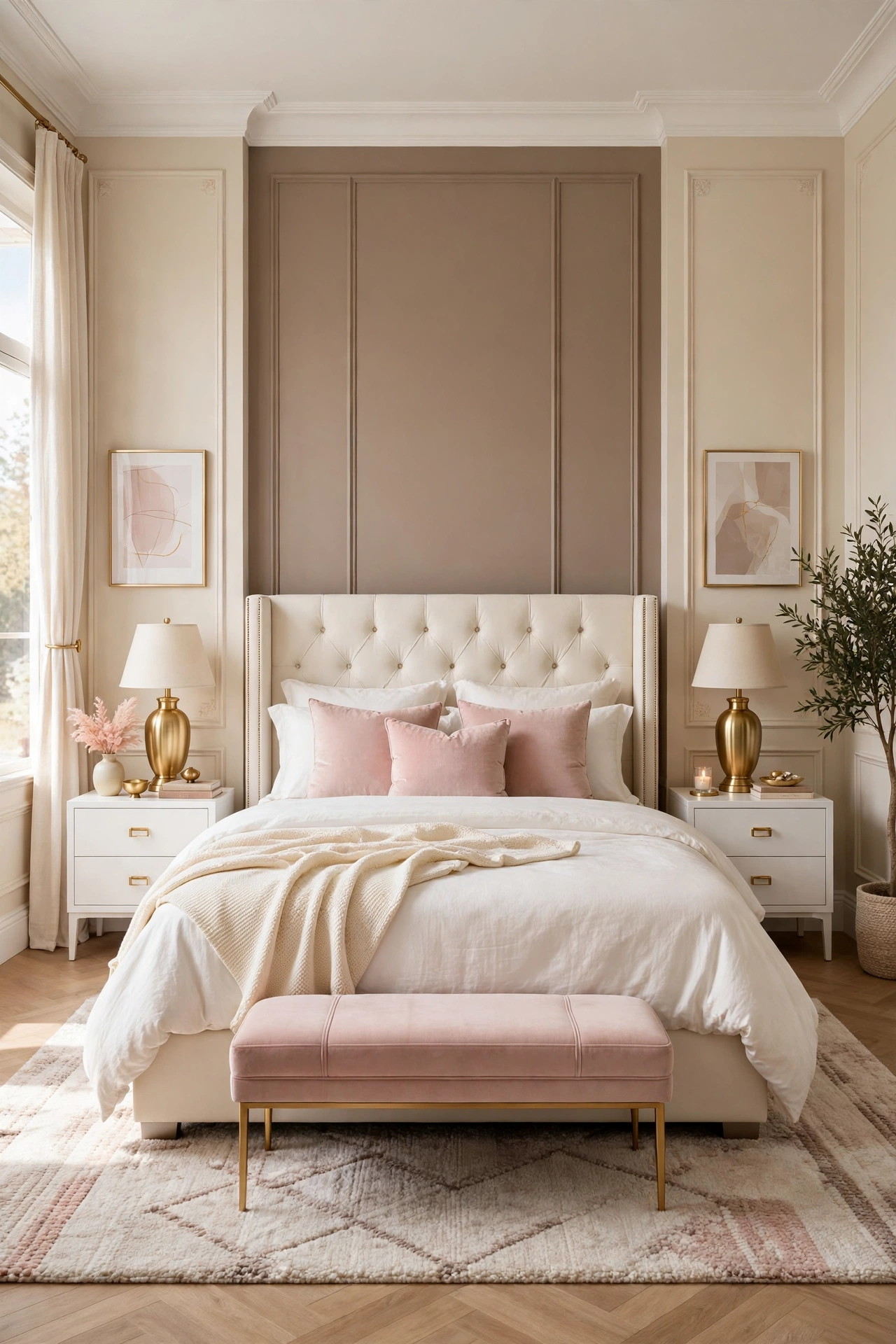
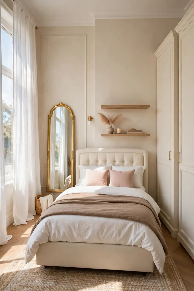
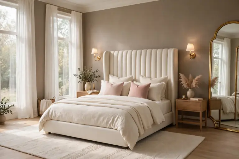
The simplest accent wall is still the most reliable: one wall in warm taupe, two or three shades deeper than the cream on the other walls, painted in a flat or matte finish. Flat paint hides the small bumps and tape lines that every bedroom wall has, and taupe sits between warm and cool, so it agrees with gold lamps, white bedding, and blush cushions without asking any of them to change.
It works because contrast, not decoration, is what a bed wall needs first. The ivory headboard reads as a bright shape against the deeper wall, the gold lamps glow instead of blending in, and the whole bed end of the room gains depth while the sleeping side of the room stays light. It is also the only idea on this list that can be finished between lunch and bedtime.
How to do it: Test the taupe on a large card and tape it behind the bed, then check it at night under lamp light, because taupe turns gray and cold under the wrong bulb. Paint the bed wall only, with two coats, and cut in carefully at the ceiling and side walls so the color block stays crisp. Keep the ceiling and trim warm white, not bright blue white, so the edge looks soft rather than striped. Pro Tip: Choose a taupe with a warm or greige undertone and warm white bulbs, around 2700K, and the wall will look like candlelit plaster in the evening instead of concrete. Common mistake: Painting the accent wall a color that is only slightly darker than the other walls. Weak contrast reads as a painting error, not a decision, so commit to a clear two or three shade jump.
2. Classic Panel Molding in a Soft Grid
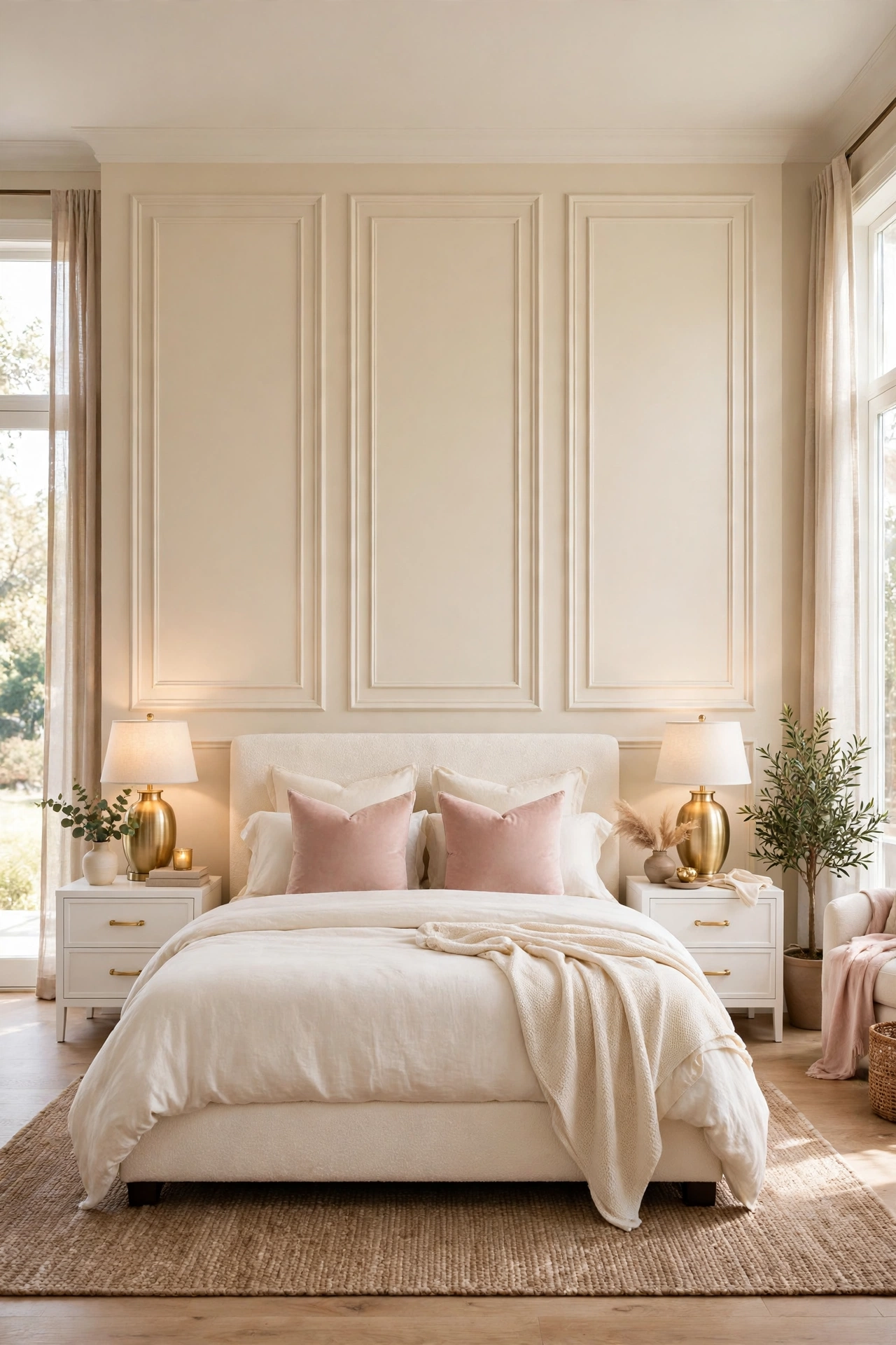
Panel molding is the wall treatment behind most hotel bedrooms that feel expensive: thin wood trim applied to flat drywall in large rectangles, then the whole wall painted one color, so the effect is shadow and proportion, not pattern. On a bed wall it does something paint alone cannot, it gives a plain wall architecture, and architecture is what makes a room read as built rather than decorated.
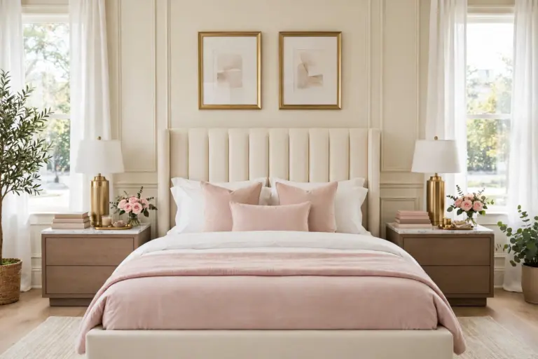
The grid works best when it is planned around the bed, not measured off the wall alone. One wide panel centered behind the headboard and one narrower panel over each nightstand echoes the room layout, so the wall looks designed for this bed in this position. Painted cream or warm white, it stays timeless, and the gold lamps and blush textiles supply all the color the wall needs.
How to do it: Sketch the wall to scale and mark the bed and nightstand widths first, then set panel sizes to match them, keeping gaps between panels and edges even, usually 4 to 6 inches. Use thin primed trim, fix it with adhesive and small pins, fill every joint, and caulk the inside edges so no shadow gap shows. Paint trim and wall together in the same satin or eggshell finish so the panels read as one carved surface. Pro Tip: Stand at the door and photograph the taped outline before fixing anything. Panel mistakes are proportion mistakes, and tape is free to move. Common mistake: Too many small panels. A busy grid of little rectangles looks like a fence; three large calm panels look like a luxury hotel.
3. Upholstered Wall Panels Behind the Pillows
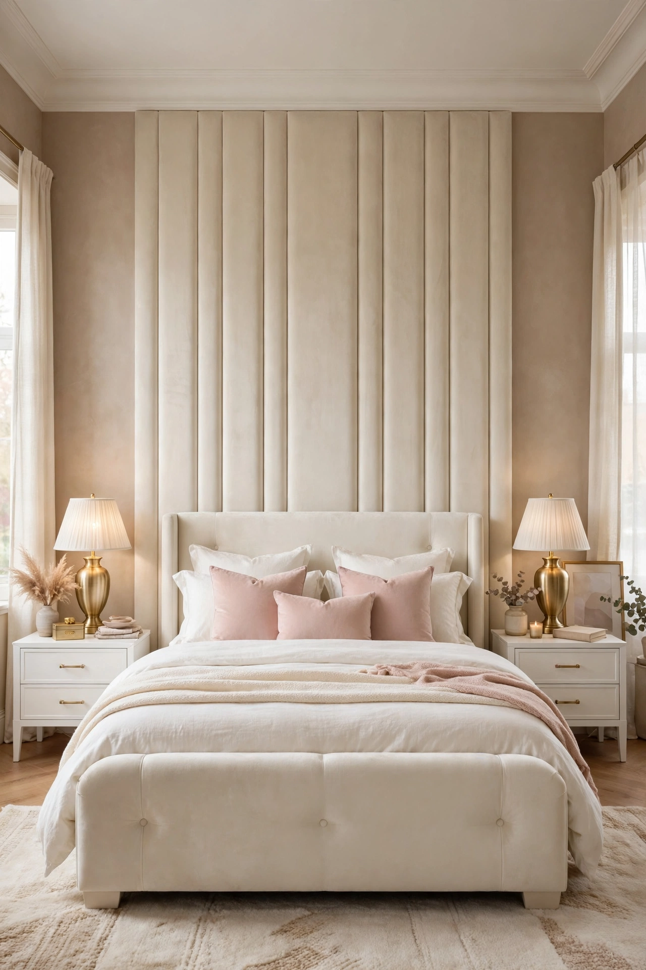
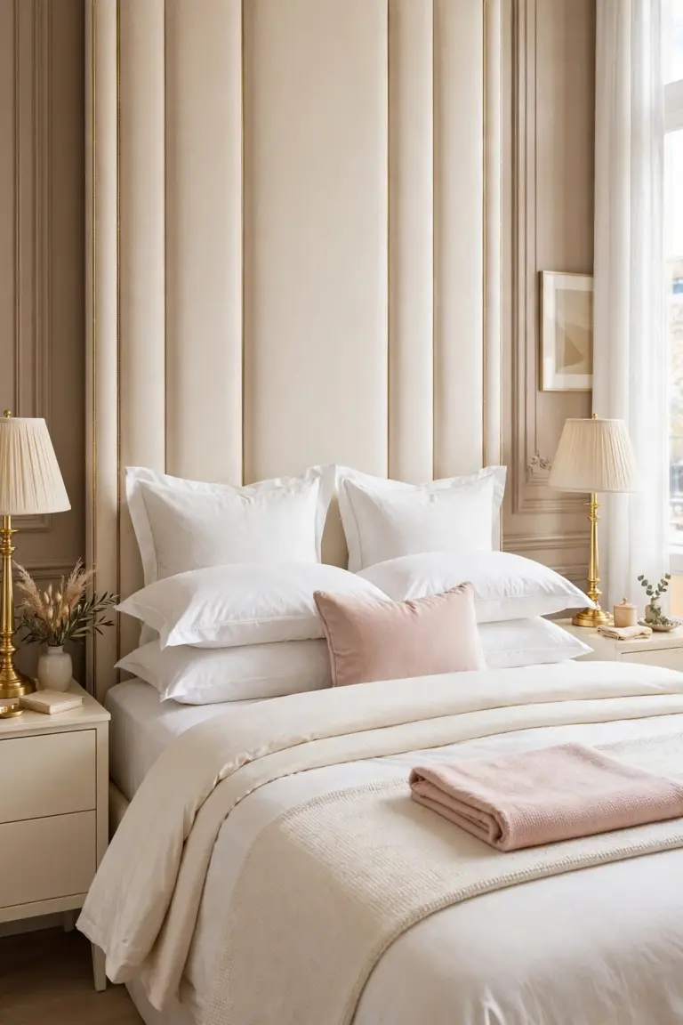
Upholstered panels turn the accent wall into part of the bed itself. Tall rectangles of foam backed fabric, in cream velvet or a boucle look fabric, rise from behind the pillows to near the ceiling, softening the room in three ways at once: they absorb sound, they give leaning readers a padded back, and they remove every hard edge from the wall the bed touches.
Their glamour is in the seams. Even vertical channels or large plain panels with tight gaps read as a five star headboard wall, and because the fabric is pale, light from the bedside lamps rakes across it and shows its texture all evening. Keep bedding simpler than usual with this wall, since the wall is already the soft statement.
How to do it: Plan panels to run from just below mattress height to a line level with the top of the window frames or higher, and make the full run at least 12 inches wider than the bed on each side. Fix a flat batten or panel system to the wall studs, never to drywall alone, because pulled fabric panels are heavy. Choose a stain resistant performance fabric in cream or warm ivory, and keep one spare panel worth of fabric for future repairs. Pro Tip: Plain large panels age better than deep button tufting, which dates quickly and holds dust in every fold. Common mistake: Stopping the panels exactly at the edges of the bed. The wall then looks like a wide headboard that missed; running wider makes it architecture.
4. Cloudy Limewash in Warm Ivory
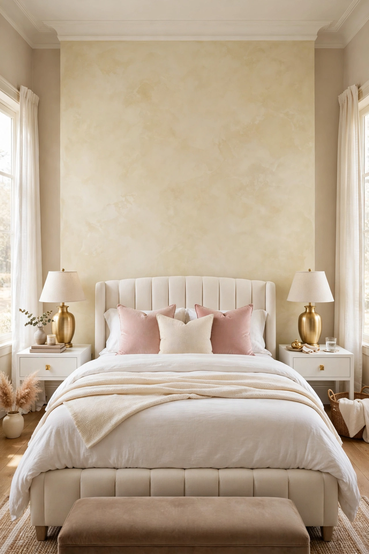
Limewash is a mineral paint applied with a large brush in loose crossing strokes, and it dries with soft cloudy movement instead of one flat color. In warm ivory or pale taupe it gives a new build bedroom the depth of an old plaster wall in a country house, which is exactly the contrast glam furniture needs: the gold stays sharp, the wall behind it feels aged and calm.
Unlike flat paint, limewash changes through the day. Morning light shows the pale tones, evening lamp light deepens the clouds, so the same wall gives the room two moods for one tin of paint. It pairs best with natural textures, linen bedding, light wood, and stone look accessories, and it needs no pattern anywhere else in the room.
How to do it: Use a proper limewash paint and the block brush made for it, and apply two coats in random crisscross strokes, keeping a wet edge so the clouds blend instead of striping. Work in full wall sections and do not try to correct a patch once it starts drying, because limewash lightens a great deal as it dries and most apparent flaws vanish. Test the color deeper than your target, since the dry result is usually one shade lighter. Pro Tip: Limewash over a standard painted wall needs the primer the maker specifies; skipping it is why some walls peel or dry patchy. Common mistake: Applying limewash with a roller like normal paint. The roller erases the cloudy movement that is the entire point of the finish.
5. Vertical Slats in Light Oak
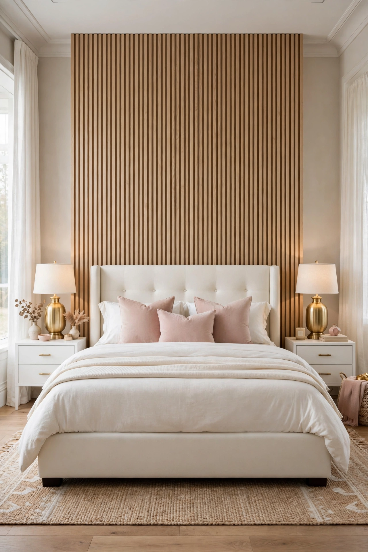
Vertical wood slats bring the one material the glam palette lacks: real timber grain. In light oak, fixed over a warm taupe or cream backing wall, they add rhythm, height, and a quiet modern line that suits both Scandinavian and luxury rooms. The eye reads the repeated verticals as extra ceiling height, which is why this idea is a favorite in bedrooms with low ceilings.
On a bed wall the slats should be treated like furniture, not cladding. A run centered on the bed, from wall edge to wall edge or as a wide panel behind the bed only, frames the sleeping zone and gives plain cream bedding a rich textured backdrop. The shadow gaps between slats do the decorating, so bedding and art can stay minimal.
How to do it: Decide first between a full wall and a centered panel, and keep the backing wall painted a shade close to the oak shadow tone so gaps read as depth, not stripes. Fix slats to battens screwed into studs, check the first three slats with a level and a spacer block, and repeat the spacer all the way across for even gaps. Finish raw oak with a clear matte coat so it keeps its pale color and does not yellow. Pro Tip: Run the slats only behind the bed and stop them at a clean end trim. A part wall in slats looks designed; slats wrapped around corners look like a sauna. Common mistake: Gaps of random width. The entire effect is rhythm, and one uneven gap breaks it from across the room.
6. Soft Botanical Wallpaper Behind the Bed Only
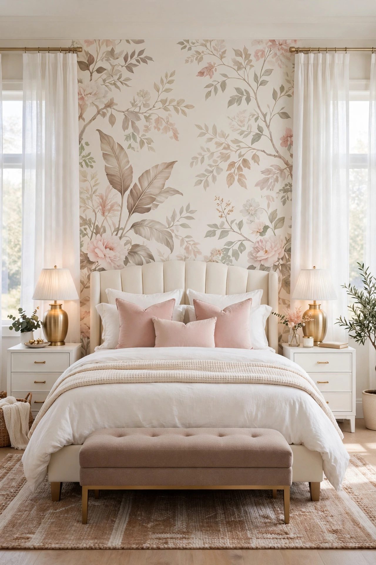
Wallpaper returns as an accent wall when the pattern is soft enough to live with for a decade: a large scale botanical print, cream ground, taupe stems, blush blooms, and a little soft green. Behind the bed, the headboard hides the busiest part of the repeat, so what shows on each side and above reads as a calm garden panel rather than a patterned room.
Limiting wallpaper to the bed wall solves its two classic problems. Cost drops, since one wall takes a fraction of the rolls, and commitment drops with it, because one wall can be stripped in an afternoon when tastes change. It also keeps the pattern where it works hardest, as a backdrop, instead of competing with curtains and art on every side.
How to do it: Order a sample and tape it behind the bed for a full day, checking the scale against the headboard height; the motif should be large enough that whole leaves show above the pillows. Start hanging from the center of the wall, not the corner, so the pattern sits balanced behind the bed. Match the ground color of the paper to the paint on the other walls for a soft join at the corners. Pro Tip: A matte or fabric look paper photographs calm and expensive; a shiny paper shows every wall bump and every seam. Common mistake: A small busy print. At bed wall scale it vibrates, dates fast, and fights every patterned cushion in the room.
7. Two-Tone Color With a Picture Rail Line
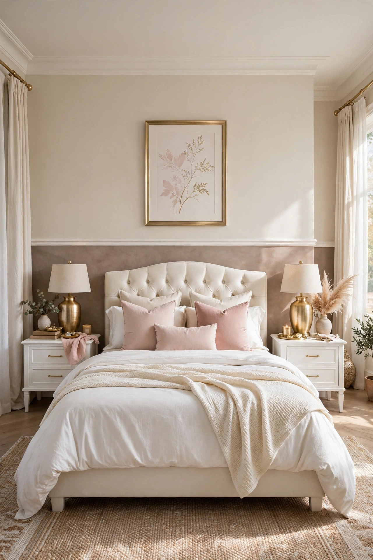
A two-tone wall splits the bed wall horizontally: warm taupe or deep cream below a picture rail, soft cream above it, with the rail itself painted to match one of the two tones. The line does quiet structural work. It gives the long plain wall a proportion, roughly lower third to two thirds, that classical rooms have always used, so the modern bed sitting against it looks grounded instead of parked.
The lower tone takes the scuffs, bag corners, and headboard rub that a bed wall collects, and it can be repainted alone in an hour without touching the rest of the wall. The paler upper section keeps the room bright at ceiling level, so even a deep lower color never makes the bedroom feel smaller.
How to do it: Set the rail height first, level with the top of the headboard or a little above, and mark it with a laser level or a long spirit level, never by eye. Paint the upper section first and let it dry fully, then tape the line and paint the lower section, removing the tape while the paint is still slightly wet for a clean edge. Fit a slim rail molding on the line if you want the finished, architectural version, and paint it the lower color. Pro Tip: Keep both tones in the same warm family. A warm taupe below and a cool blue white above will look like two different rooms stacked. Common mistake: Splitting the wall exactly in half. Half and half looks indecisive; a lower third or a lower two fifths reads as a deliberate proportion.
8. An Arched Inset Painted in Blush
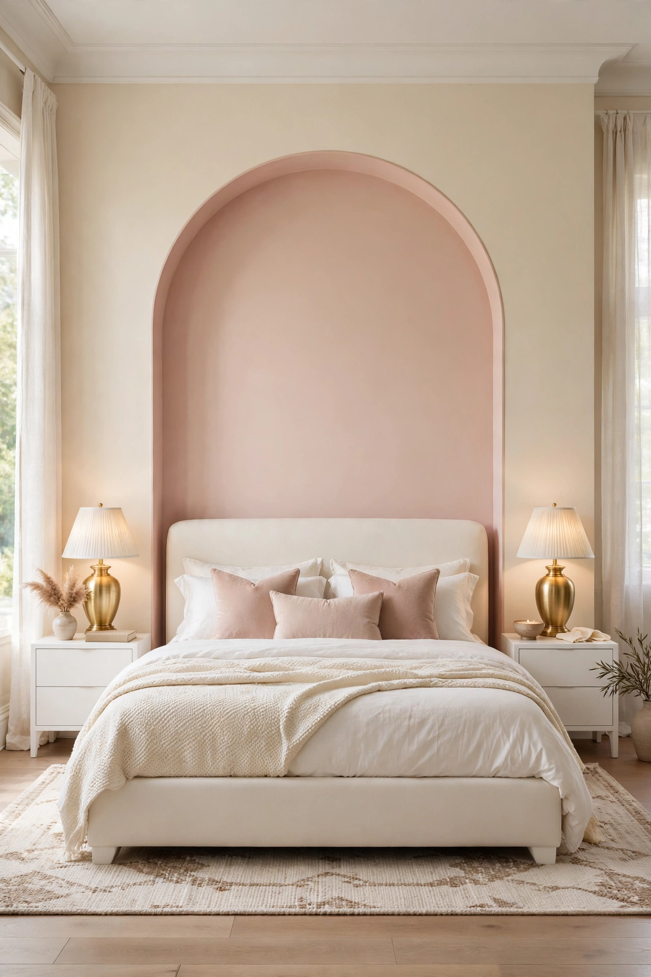
An arch painted on the wall behind the bed gives the room a soft architectural shape without any building work. The curve echoes the shapes glam rooms already love, round mirrors, curved headboards, oval trays, and in blush pink it adds the palette’s one romantic color in a large calm area instead of in scattered small accessories.
The arch works because it frames exactly what should be framed: the bed and the lamps, nothing else. Its top curve lifts the eye and makes a standard ceiling feel taller, and because it is only paint, a renter or a restless decorator can change it in a day. Inside the arch, keep styling minimal; the shape is the decoration.
How to do it: Mark the arch from the center line of the bed: two straight sides a little wider than the bed, joined by a half circle top, drawn with a pencil on a string pinned at the center point for a true curve. Tape outside the line with flexible painter tape, or cut in freehand with an angled brush if your hand is steady. Apply two coats of blush in a matte finish, and paint the remaining wall warm cream so the arch glows against it. Pro Tip: A matte finish is essential; shine on a painted shape shows every brush mark and makes the arch look like a sticker. Common mistake: Making the arch exactly bed width. It must clear the nightstands or stop well inside them, because an arch that clips the lamps looks like a measurement error.
9. Stone-Look Plaster With a Matte Finish
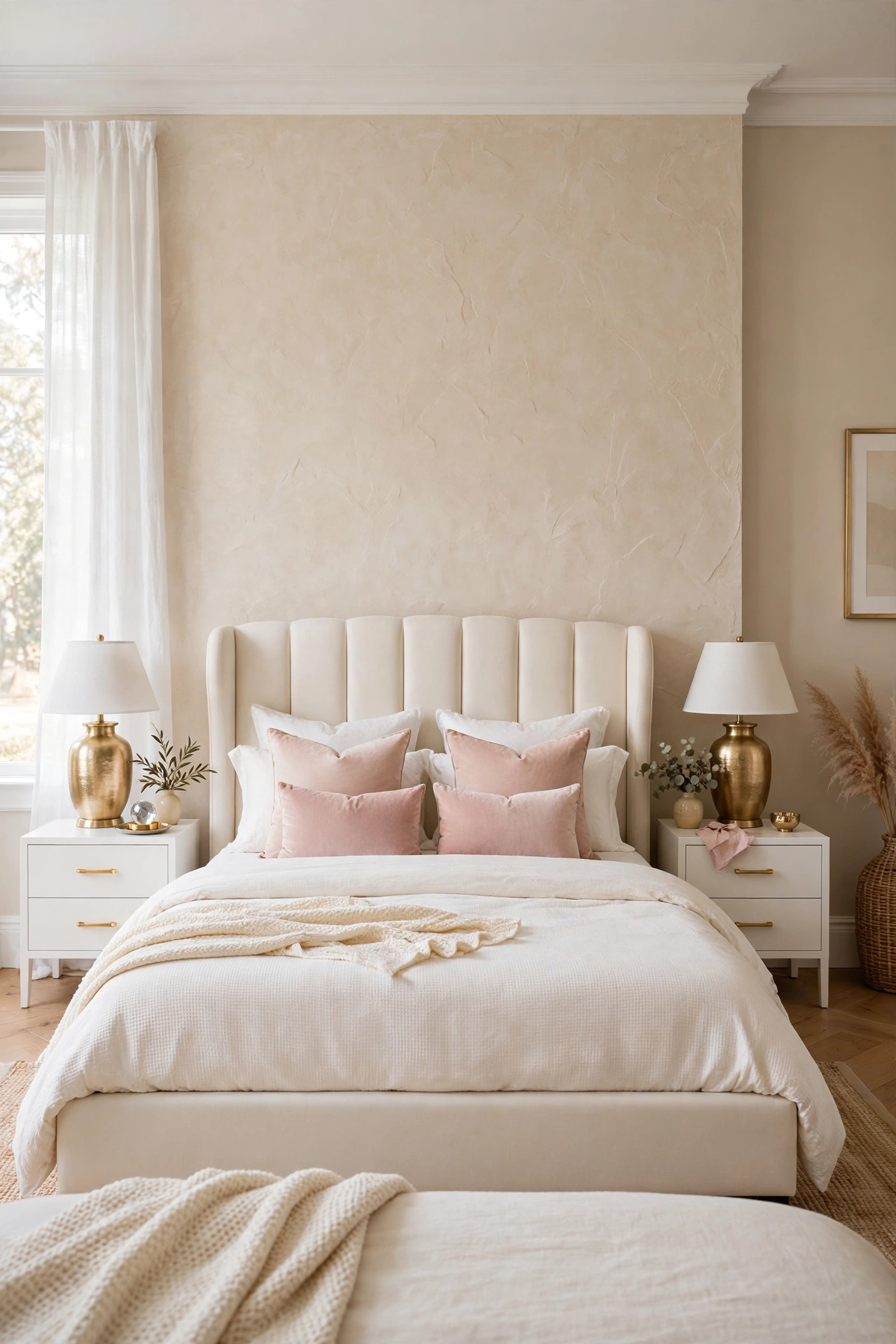
Stone-look plaster, sold as microcement style coatings, Venetian plaster, or textured mineral paint, gives the bed wall the cool, trowelled surface of cut stone without weight, cutting, or a mason. In warm cream or pale greige it sits behind gold lamps like the wall of a boutique hotel suite, and its slight movement catches light differently at every hour.
This is the most forgiving wall on the list for imperfect drywall, because the trowel texture hides minor dents and old repairs instead of spotlighting them the way flat paint does. It is also the most permanent, so it belongs in owned homes and long term rooms, in a tone chosen to outlast several bedding changes.
How to do it: Use a complete system from one maker, primer, plaster, and sealer, because mixing brands is where finishes fail. Apply thin coats with a steel trowel in short sweeping arcs, letting each coat dry fully before the next, and build two or three coats rather than one thick one. Seal with the matte sealer, never gloss, and test the whole process on a board first to learn the trowel pressure the finish needs. Pro Tip: Keep a small labeled pot of the mixed plaster for touch ups; plaster walls mark where furniture rubs, and a matched repair keeps them invisible. Common mistake: Working too large an area at once on a warm day. Plaster sets fast, and rushed sections dry with visible lap lines that no sealer can hide.
10. A Full Fabric Wall in a Cream Boucle Look
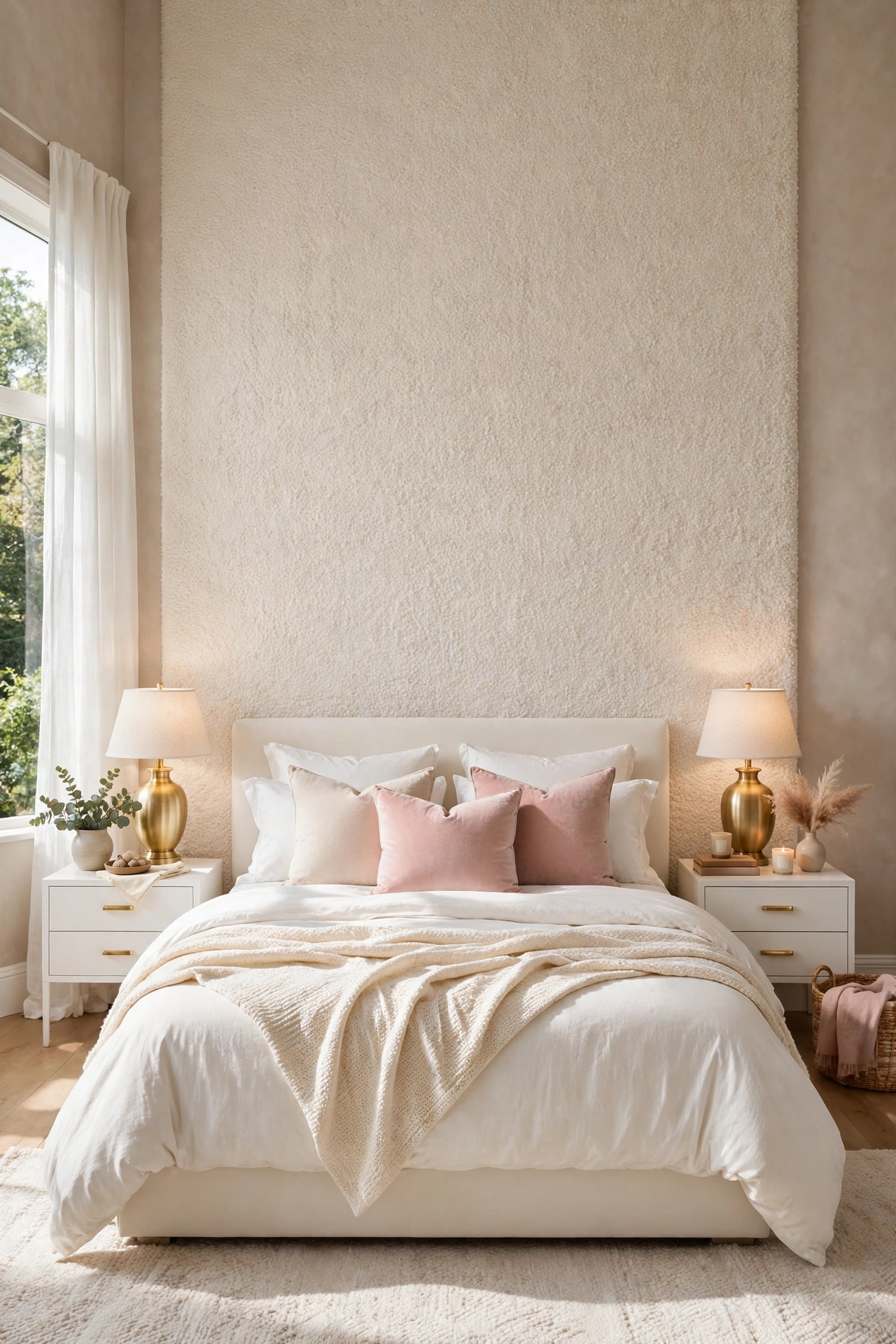
A fabric wall takes the softness of Idea 3 one step further: the entire bed wall covered in a cream boucle look fabric, stretched or upholstered in place, so the wall reads as one continuous soft surface. It is the quietest luxury on this list, giving the bedroom the hush and warmth of a tailored hotel suite, and it hides a poor wall completely.
Fabric changes how the room sounds as much as how it looks. The bed wall stops reflecting the small noises of the night, and lamp light lands on texture instead of flat paint, which makes cream bedding against it look deep and layered rather than plain. Keep every other textile plain with this wall; two strong textures in one room start to argue.
How to do it: Choose an upholstery weight fabric rated for wall use, or a fabric backed wallpaper that copies the boucle look with far easier fitting and cleaning. Fit panels between thin battens fixed to studs, stretch evenly, and finish edges with a slim covered trim so no staple line shows. Keep the fabric a true warm cream, checked against the bedding in daylight, because two creams that clash will fight every day. Pro Tip: The wallpaper version gives renters and cautious owners the same look with a strip and rehang exit; price both before committing to true upholstery. Common mistake: Using dress weight fabric. It sags between fixings within months, and a sagging wall cannot be ironed flat again.
11. A Gallery Ledge Wall for Rotating Art
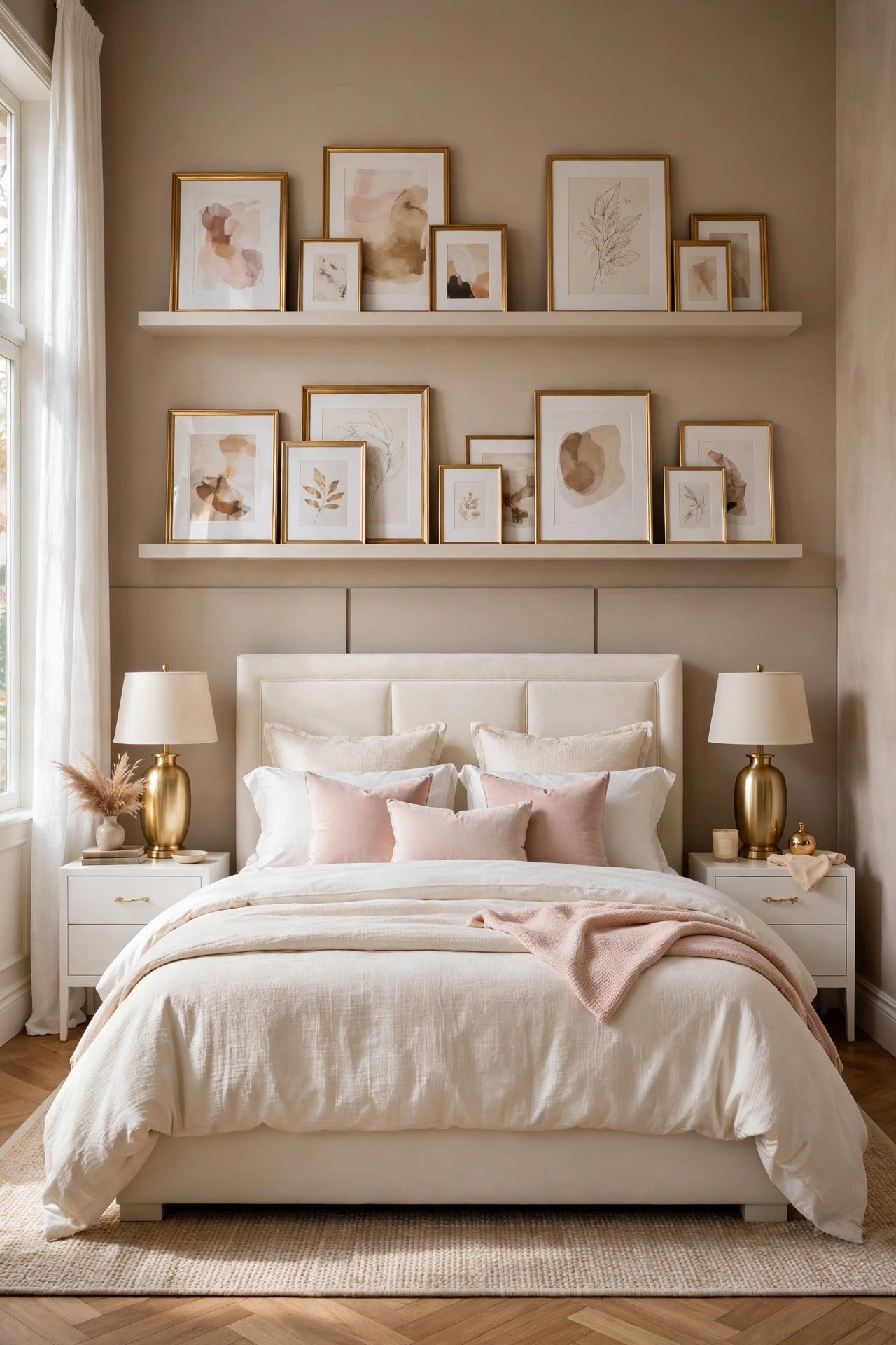
Most bedrooms have too little art, hung too finally. Two long picture ledges on the wall above and behind the bed change that: frames lean instead of hanging, so art, prints, and small objects can rotate with the seasons, move when bedding changes color, and leave without a wall full of holes. In gold or warm white, the ledges themselves become the wall’s horizontal lines.
The ledge wall solves the art over bed safety question as well as the styling one. Nothing hangs from a single hook over the pillows; frames sit in a channel with a raised lip, and the heaviest pieces can live at the ends over the nightstands instead. It is the best idea on this list for readers who love change, because the wall can be restyled in ten minutes with both feet on the floor.
How to do it: Fix two ledges into studs at heights that clear the headboard by at least 12 inches for the lower ledge, and space the pair so tall frames fit the lower one. Keep total weight honest; a ledge of large frames is heavy, and drywall anchors alone are not enough for the long runs. Style in layers, large frames at the back, small ones overlapping at the front, and leave a third of each ledge empty so the arrangement breathes. Pro Tip: Keep a stored box of spare prints in the palette, blush abstracts, line drawings, botanical plates, and rotate one frame a month; the room feels redecorated for free. Common mistake: Hanging a single heavy frame on a hook above the pillows instead. Over a bed, lean it on a ledge or move it to another wall.
12. Mirror Panels That Borrow the Window Light
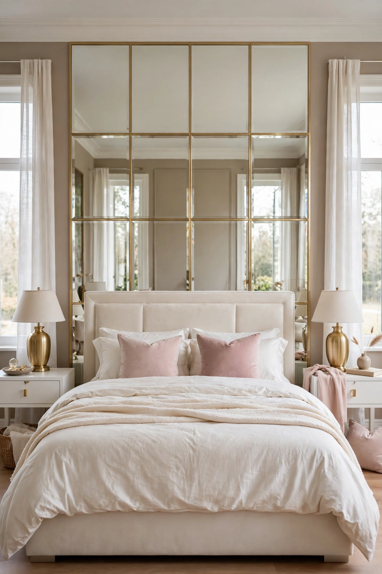
Mirror panels behind a bed sound bold, but done as a calm grid of tall panels with slim gold or warm wood frames, they act less like mirrors and more like extra windows. They borrow light from the real window and throw it back into the room, they double the glow of the bedside lamps at night, and their reflections of cream bedding and blush cushions keep the palette soft instead of shiny.
This is the strongest idea on the list for a small or north facing bedroom, where the bed wall is often the darkest surface in the room. The panels must be planned like glazing, even divisions, frames in line with the bed posts, and glass fixed by a professional if the panels are large, because mirror over a bed is the one job on this list where fitting quality is a safety matter, not a style one.
How to do it: Use two or three tall panels sized to the bed, centered on it, with frames that repeat a finish already in the room. Order acrylic mirror if weight or safety is a concern; modern acrylic reads as glass from across the room at a fraction of the weight. Have panels fixed with the maker’s recommended clips or adhesive system, and keep the reflection test in mind: lie in bed, sit up, and check what the panels show from the door before final fixing. Pro Tip: Antique or softly smoked mirror flatters a bedroom far more than perfect silver mirror, which can feel like a gym; the softened reflection keeps the glamour and drops the glare. Common mistake: One large unframed sheet. It reads as a dance studio, shows every fixing, and reflects the ceiling fan in high definition.
13. A Painted Headboard Shape
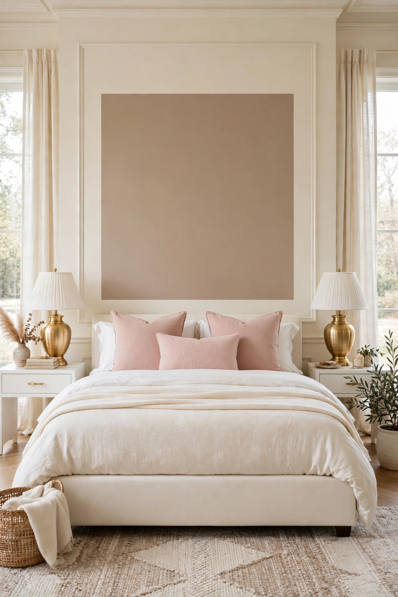
A painted headboard is the budget hero of accent walls: a rectangle, arch, or double border shape painted directly on the wall where a headboard would stand, in warm taupe, deep cream, or soft blush. For a bed frame with no headboard, or a low simple one, the painted shape supplies the missing architecture at the cost of half a tin of paint.
It works because the eye needs a frame around pillows more than it needs a physical object. The painted shape gives white bedding an edge to sit against, makes a plain frame look chosen, and in a small room it saves the 4 to 6 inches a real headboard would steal from the floor. Add a slim picture frame molding inside the painted edge and most guests will not realize the headboard is paint until they touch it.
How to do it: Mark the shape at least 6 inches wider than the bed on each side and rising 18 to 30 inches above the top of the mattress, tape the outline, and check it from the door with the pillows in place before painting. Paint in a matte or eggshell finish, two coats, and remove tape while the second coat is fresh for a crisp line. If the bed has a low headboard already, paint the shape taller than it, so the two read as one layered piece. Pro Tip: Paint the same shape, smaller, on the opposite wall behind a dresser or reading chair, and the room gains a matched pair of architectural moments for one tin of paint. Common mistake: Matching the shape exactly to the mattress width. Pillows spill past it on both sides and the shape looks like it shrank in the wash.
14. Wainscot Half Wall With a Ledge Top
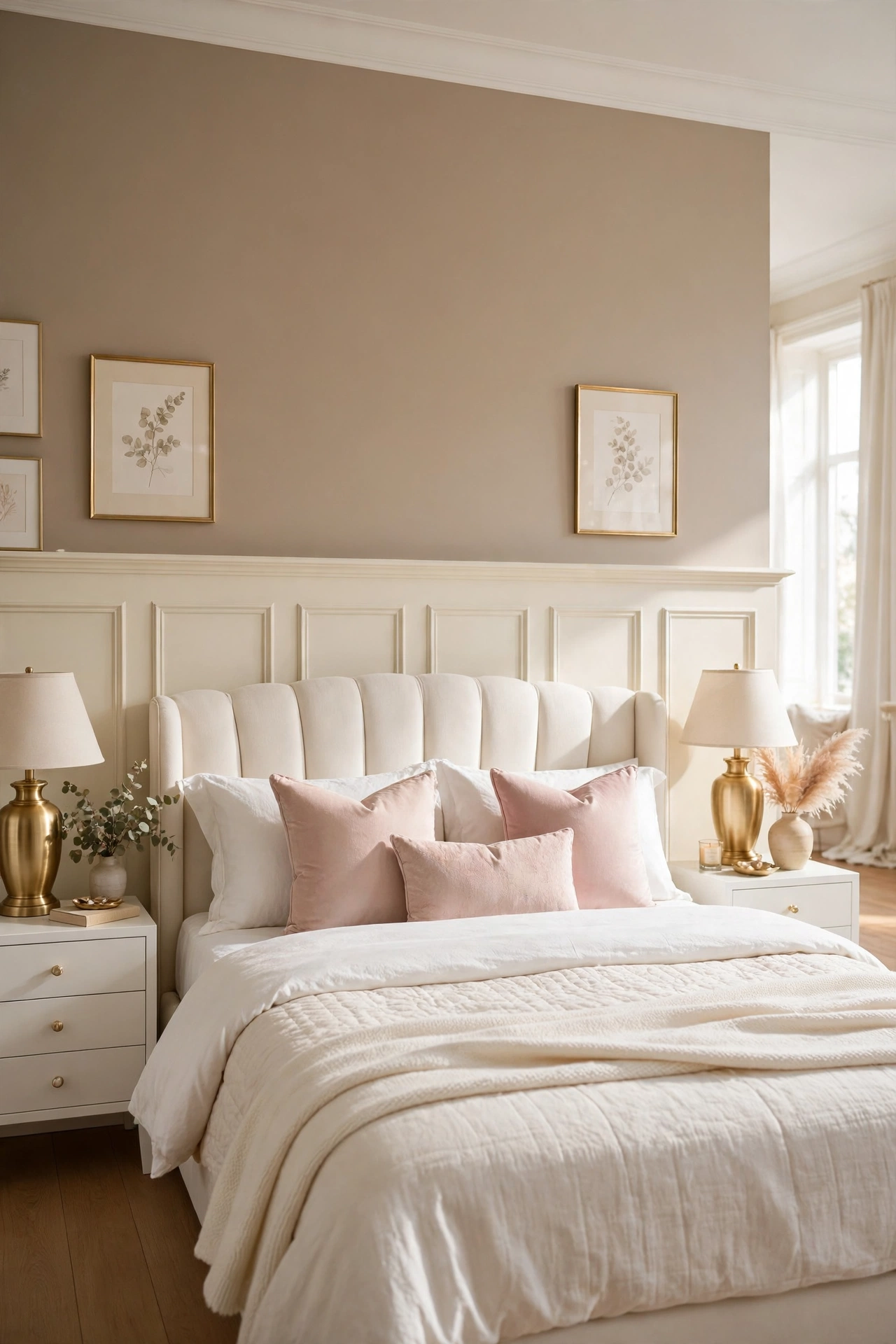
Wainscoting splits the bed wall the other way from paint alone: paneled woodwork on the lower half, finished with a slim ledge cap, and warm paint above. Behind a bed it is quietly practical, because the zone that takes headboard rub, bag scuffs, and bedside bumps becomes washable woodwork instead of marked paint, while the upper wall stays free for art or a mirror.
The ledge cap is the detail that earns its place. At chair rail height it is too low to use behind a bed, so run the wainscot higher, to just above the headboard, and the cap becomes a display line for small frames, a trailing plant, or the morning coffee cup on the nightstand side. Painted all one warm cream, panels, cap, and trim, it reads as joinery, not as a kit.
How to do it: Set the height by the bed, cap level a few inches above the top of the headboard, and mark it level around the wall. Build the panel pattern to the same rhythm as Idea 2, wide panels behind the bed and narrower ones over the nightstands, using sheet material and trim for a flat, paint grade finish. Caulk every top edge where panel meets wall, prime bare wood before painting, and finish with a scrubbable satin so the lower wall can be wiped clean. Pro Tip: An eggshell or satin sheen on wainscot, against matte paint above it, gives a subtle two finish effect that makes one color look like two materials. Common mistake: Stopping the wainscot at standard chair rail height behind a tall headboard. The cap line disappears behind the bed and the proportions look accidental.
15. Soft Ombre From Taupe to Cream
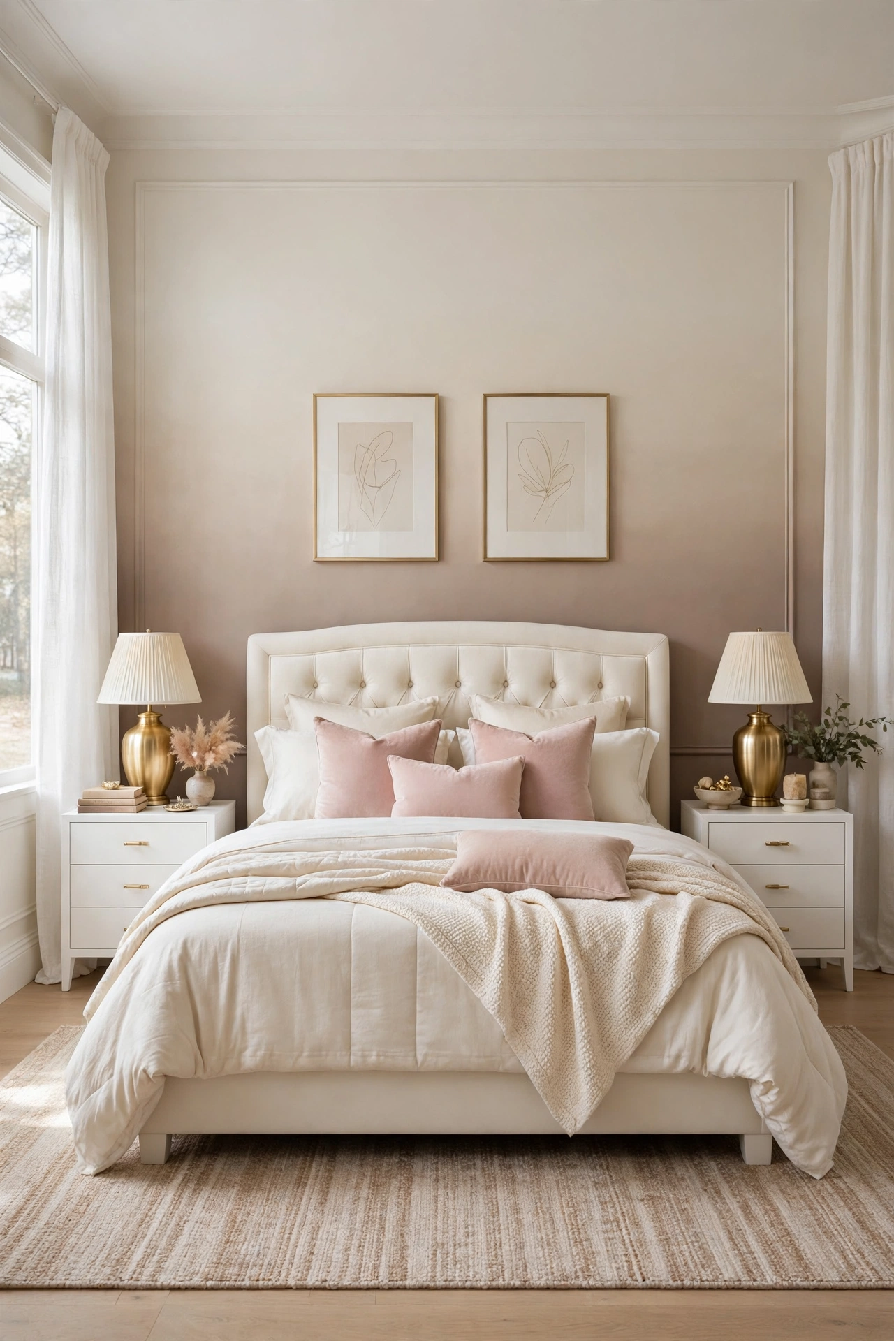
An ombre wall fades one color into another with no hard line: warm taupe at the base behind the pillows, melting through soft greige to cream at the ceiling. It gives the bed wall the depth of the taupe paint in Idea 1 and keeps the airy brightness of the cream wall in Idea 4, in one finish that suits rooms that cannot decide between dark and light.
The fade also does practical work. The deepest tone sits where the headboard and pillows hide most of the wall, so the visible effect is a gentle glow rising behind the bed rather than a dark block, and tall rooms gain a sense of height as the color lightens upward. Ombre forgives nothing in technique but costs nothing in materials beyond two paints, so it rewards practice more than spending.
How to do it: Paint the whole wall the paler cream first and let it dry. Then work in three horizontal bands, full taupe at the base, a half and half mix in the middle, full cream at the top, blending each boundary with a large dry brush or sponge while the edges are still wet. Work fast, in one session, with a helper on the second ladder if the wall is wide, because a dried edge cannot be blended after the fact. Pro Tip: Practice the fade on a large board and live with it for a day; ombre reads stronger on a wall than in the tin, and most first attempts need the tones one step closer together. Common mistake: Too many bands of obvious stripes. Three blended zones should read as one fade from across the room, never as a rainbow of lines up close or far away.
Quick Reference Table
| Accent Wall Idea | Best For | Effort | Key Rule |
|---|---|---|---|
| Warm taupe paint | Any bedroom, renters with permission | Low | Two to three shades deeper, tested at night |
| Panel molding grid | Plain new build walls | Medium | Panels sized to the bed, not the wall |
| Upholstered panels | Readers, quiet rooms | High | Run wider than the bed |
| Limewash | Natural, aged texture | Medium | Block brush, crisscross strokes, no roller |
| Light oak slats | Low ceilings, modern rooms | High | Even gaps, slats only behind the bed |
| Botanical wallpaper | Pattern lovers | Medium | One wall, large scale, matte finish |
| Two tone with picture rail | Scuffed bed walls | Low | Split at a third, not in half |
| Blush arch inset | Small romantic rooms | Low | Matte paint, wider than the bed |
| Stone look plaster | Owned homes, luxury finish | High | One maker system, thin coats |
| Fabric wall | Quiet, tailored suites | High | Upholstery weight, or wallpaper version |
| Gallery ledge wall | Art collectors, changers | Medium | Ledges into studs, a third left empty |
| Mirror panels | Small, dark bedrooms | High | Professional fixing, antique finish flatters |
| Painted headboard | Budget, no headboard beds | Low | Wider than the mattress, matte finish |
| Wainscot half wall | Busy family bedrooms | Medium | Cap level just above the headboard |
| Soft ombre | Tall rooms, indecisive palettes | Medium | Three bands, blended wet, practiced first |
The Accent Wall Checklist
- [] Wall measured and bed position marked first
- [] Sample tested behind the bed, day and night
- [] Palette kept to white, cream, taupe, blush, and gold
- [] One wall only treated, the rest left calm
- [] Fixings into studs for panels, ledges, and mirrors
- [] Finish chosen for the zone, scrubbable low, matte high
- [] Lines leveled and taped before any paint
- [] Bedding kept plain enough to let the wall lead
- [] Gold lamps or frames repeating the room finish once
- [] Final check photographed from the bedroom door
Frequently Asked Questions
Which accent wall is best for a small bedroom?
The ones that add depth without adding objects: warm taupe paint (Idea 1), mirror panels (Idea 12), and the painted headboard (Idea 13). Paint and mirror work in inches of visual depth rather than inches of floor, and the painted headboard even returns the floor space a real headboard would take. Heavy builds like slats and wainscot can work too, but keep them in pale tones so the wall advances visually as little as possible.
Can renters use any of these bedroom accent wall ideas?
Yes, the paint based ones where the lease allows painting, the painted headboard and arch (Ideas 8 and 13) are the cheapest to reverse, and the fabric look can be done with fabric backed wallpaper (Idea 10). Gallery ledges need screw fixings, so they sit between: small holes, easily filled. Panels, plaster, and mirrors are owner projects. Always check the lease before paint, because one wall of color still counts as a change.
How do I choose between paint, panels, and wallpaper?
Choose by what your wall lacks. If it lacks color contrast, paint solves it in a day (Ideas 1, 7, 8, 13, 15). If it lacks architecture, panels, molding, slats, and wainscot add shadow and line (Ideas 2, 3, 5, 14). If it lacks pattern and softness, wallpaper and fabric supply both (Ideas 6, 10). Most bedrooms only lack one of the three, so buy only the fix for that one.
Conclusion
A bedroom accent wall works when it does one clear job behind the bed: add contrast with taupe or ombre paint, add architecture with molding, slats, or wainscot, add softness with upholstery, fabric, or limewash, or add light with mirror panels. Pick the job your wall actually needs, keep the palette to cream, taupe, blush, and gold, and let the bed stay simple against it. The wall will do the decorating every day, including the days the bed is barely made.