
17 Bedding Color Combinations for a Beautiful Neutral Bedroom
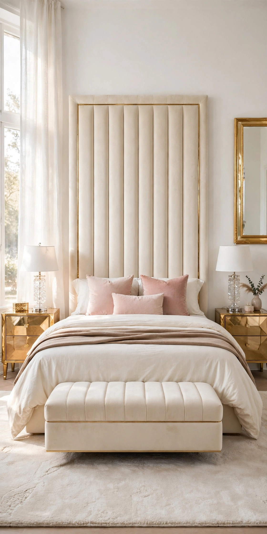
17 Bedding Color Combinations for a Beautiful Neutral Bedroom
A neutral bedroom lives or dies on its bedding, because the bed is the largest surface in the room and its colors set the temperature of everything else. Pure white alone can feel cold and flat, while layering two or three close neutral tones, a white sheet, a cream duvet, a taupe throw, gives the same calm palette depth, shadow, and that soft hotel finish readers save again and again.
These seventeen bedding color combinations all restyle the same glam bedroom and the same cream tufted bed, so you can compare the pairings honestly, layer by layer. Each one names exactly where each color sits, on the sheet, the duvet, the pillows, and the throw, and each stays inside the neutral family, with one gentle color guest, soft sage, and one deep contrast, charcoal, for readers who want a stronger edge.
1. White and Cream, the Classic Layer
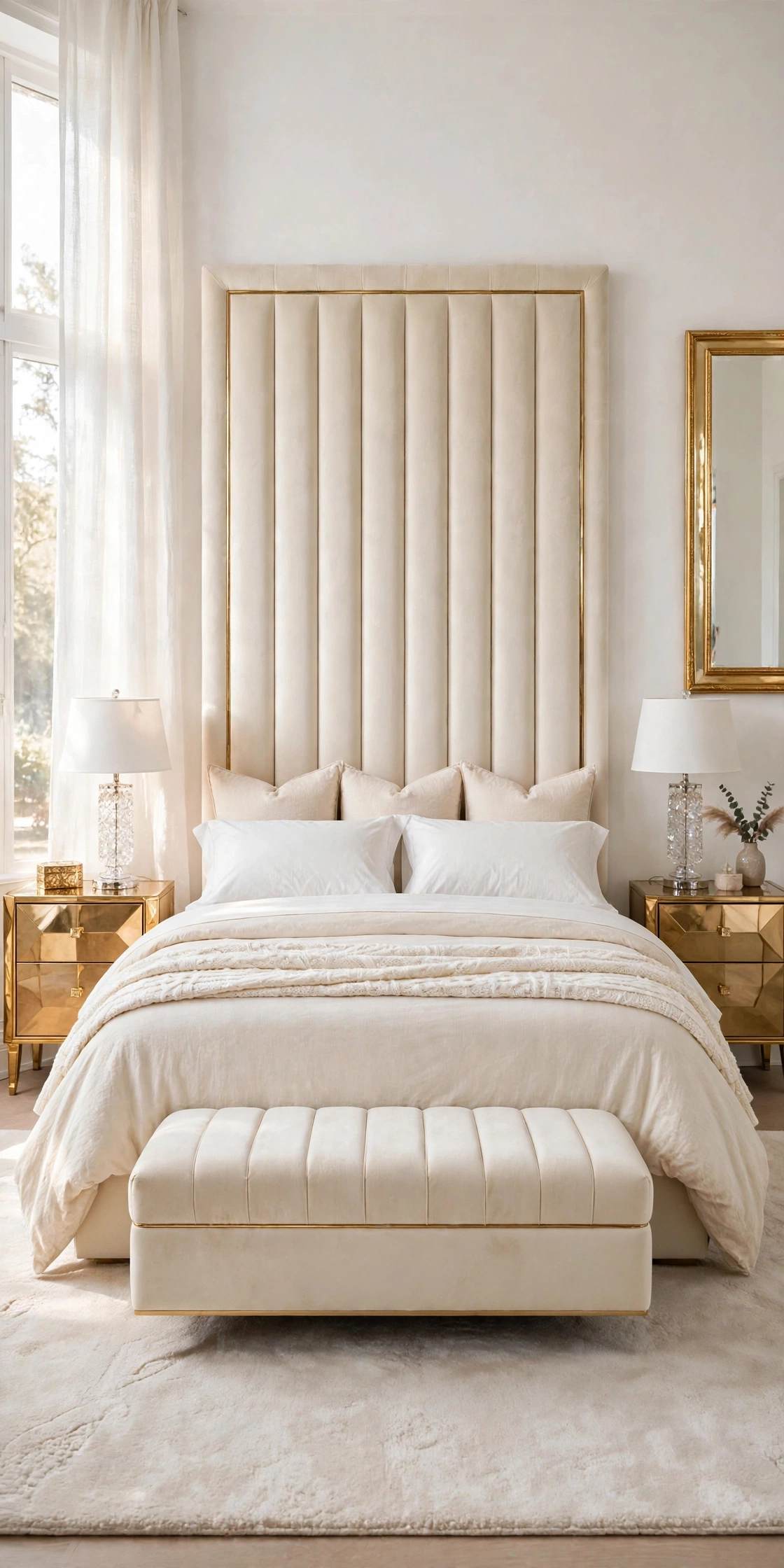
White and cream is the combination every neutral bedroom starts from, and it works because the two tones are close enough to feel calm but different enough to create a visible layer line. The white keeps the bed fresh and bright against the cream headboard, while the cream stops the white from turning cold or blue in daylight.
Place bright white on the flat sheet and the sleeping pillows, where freshness matters most and where white is easiest to wash hot. Put cream on the duvet cover and the two large Euro shams behind them, then finish with a white knitted throw folded across the foot so the eye travels white, cream, white down the bed.
How to do it: Wash the white pieces together so they stay one clean tone, and keep the cream pieces in their own load so they never pick up grey. Fold the cream duvet back by one third to show a wide band of white sheet, that band is the whole contrast. Pro Tip: If your whites have yellowed unevenly, retire the worst piece to the guest bed; mixed whites read as untidy, while matched whites read as hotel. Common mistake: Using one flat white for everything, sheet, duvet, and pillows in the identical fabric and tone, which erases every layer and makes the bed look unmade even when it is neat.
2. Cream and Warm Taupe
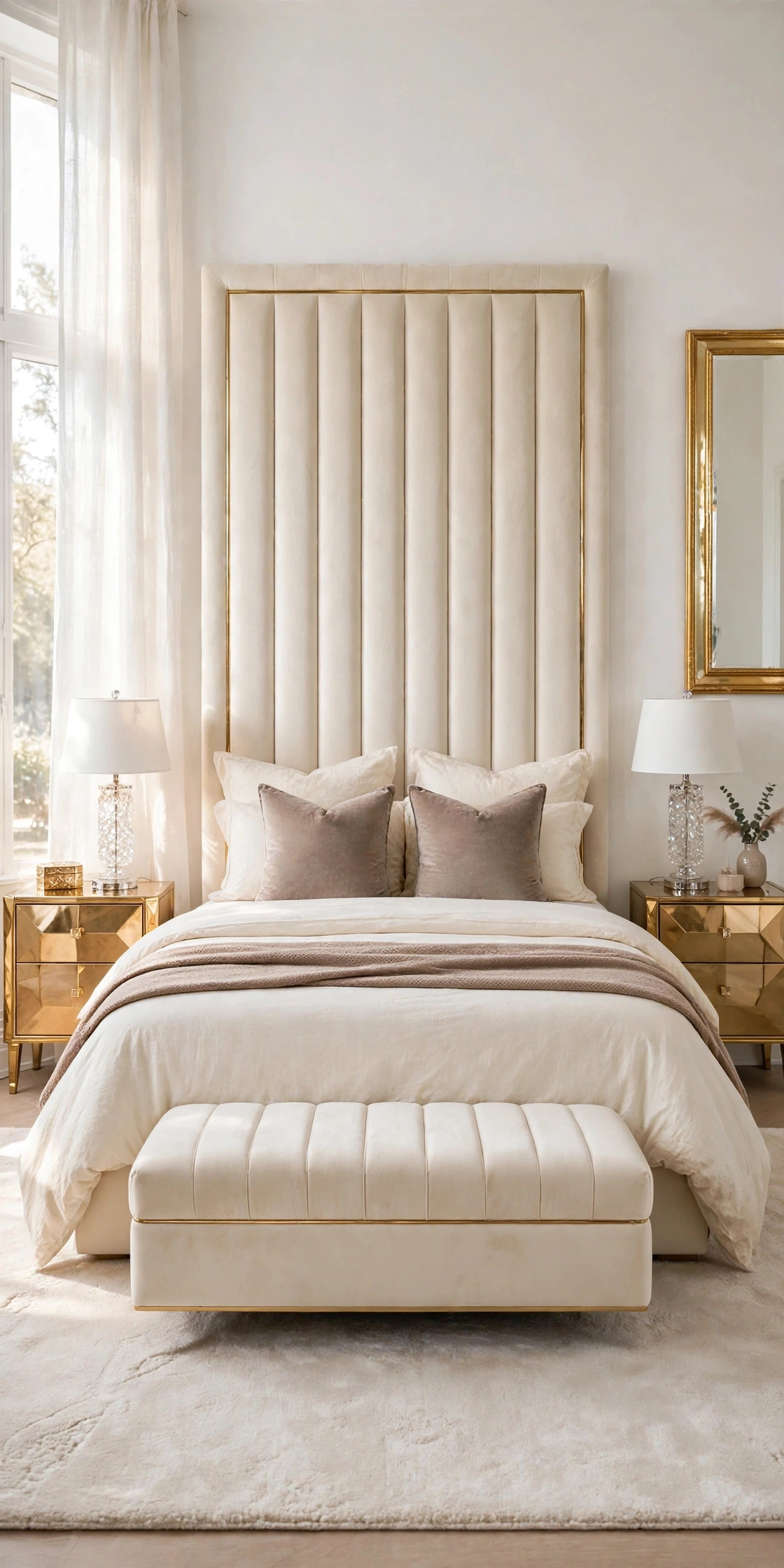
Cream and warm taupe is the pairing that makes a neutral bedroom feel expensive in the evening, when lamplight turns pale colors thin. Taupe carries brown and grey together, so it deepens cream without the heaviness of a true brown, and it links the bedding to warm wood, woven baskets, and gold metals already in the room.
Build it with cream sheets and a cream duvet as the base, then bring taupe in at the foot and the front: a taupe throw folded lengthways across the lower third of the bed, and two taupe cushion covers in front of the sleeping pillows. Keep the large Euro shams cream, so the darker color stays low and wide instead of crowding the headboard.
How to do it: Choose a taupe with a warm, slightly pink or brown base, and hold it against the cream duvet in daylight before buying; a cold grey taupe will look muddy next to cream. Repeat the taupe once more in the room, a cushion on a chair or a folded blanket on the bench, so the bed color looks chosen, not random. Pro Tip: Velvet or a nubby weave in taupe reads far richer than flat cotton in the same color, because the shadows in the texture do the decorating. Common mistake: Taupe on every layer, duvet, shams, cushions, and throw, which tips the bed from warm to heavy and hides the cream completely.
3. Ivory and Blush
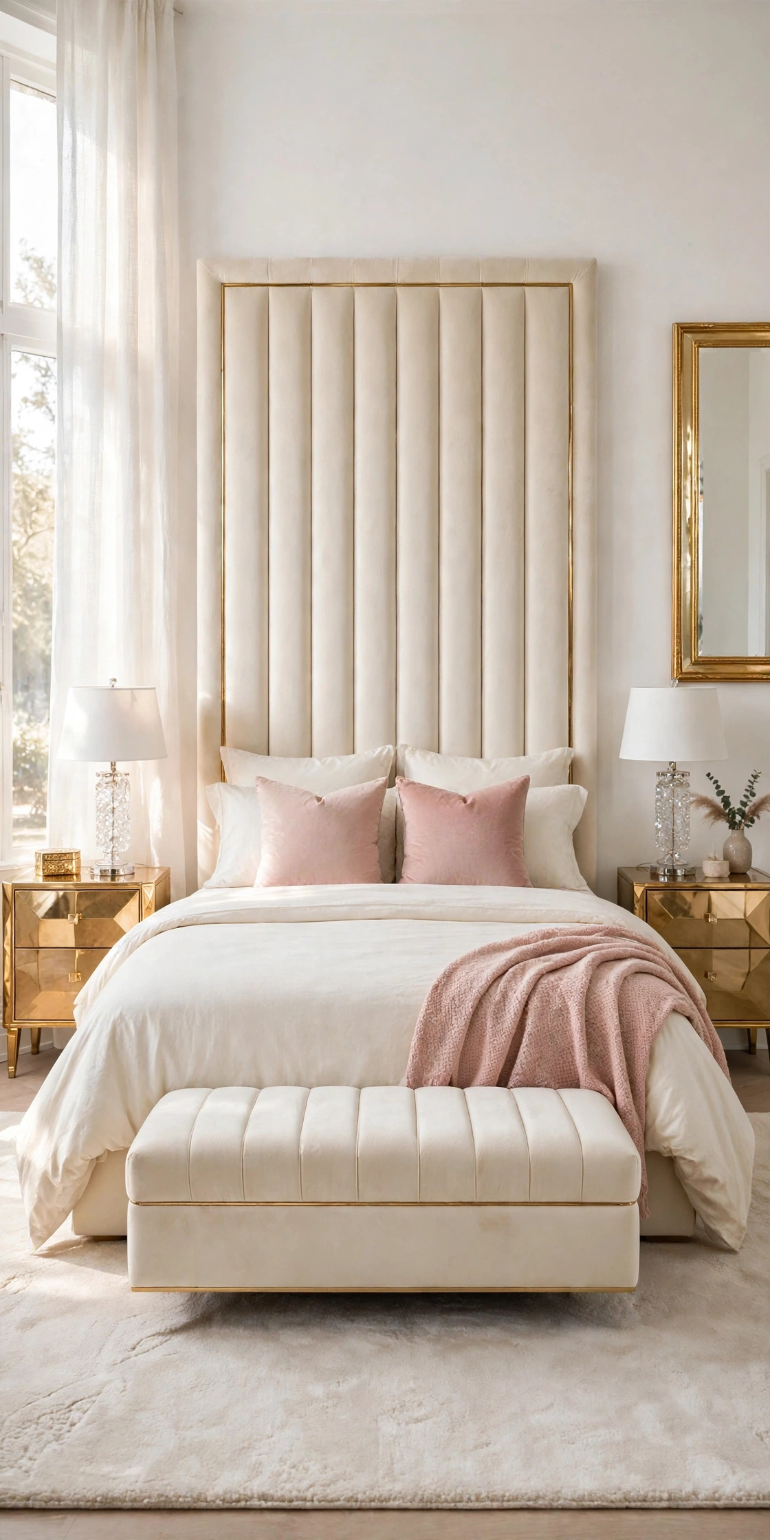
Ivory and blush is the softest pairing in this collection, and the one that gives a neutral bedroom its gentle glam note. Ivory is warmer and kinder than pure white, and a dusty, greyed blush, never a bright candy pink, sits on it like the last light of the day, feminine without turning the room sweet or young.
Keep ivory as the working base: ivory sheets, an ivory duvet, and ivory Euro shams. Add blush only where it can be changed in five minutes, the two front cushions and a blush throw laid diagonally across one corner of the foot. That placement keeps the pink in the foreground of every photograph while the bed itself stays timeless.
How to do it: Test blush in the room’s real light, because north facing light turns blush grey and warm lamplight turns it peach; the right blush holds its soft rose tone in both. Pair it with the room’s gold accents, since warm metal keeps blush looking grown up. Pro Tip: One blush piece in a second texture, a velvet cushion plus a matte cotton throw, makes the small amount of color look layered rather than matched from a set. Common mistake: Blush walls, blush bedding, and blush curtains together. The pairing needs ivory space around it; on its own ground, a little blush goes a long way.
4. White and Soft Beige
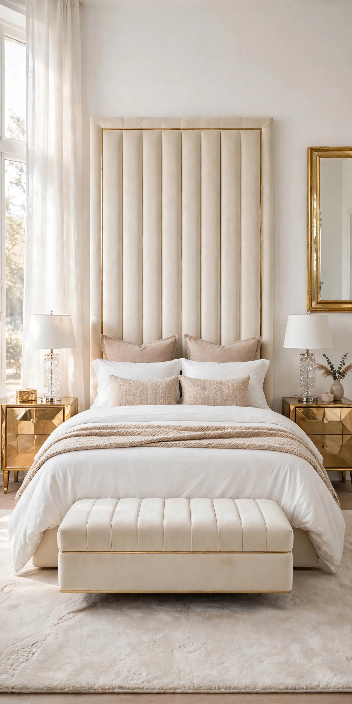
White and soft beige is the quietest combination here, made for bedrooms that get strong sun and for readers who find cream too yellow. Soft beige, the color of pale sand and unbleached linen, cools white down a degree while staying warm, and it hides everyday creasing and lint better than any other pale tone.
Let white lead on the big flat areas: white duvet cover on top, white sleeping pillows inside it. Bring the beige in on the structured pieces that hold their shape, the square Euro shams standing against the headboard and a pair of beige lumbar cushions, then a beige throw with a visible weave across the foot.
How to do it: Layer the beige at the head and the foot, not in the middle, so the white duvet stays the calm center of the bed. Match the beige to the room’s rug or curtains rather than to the headboard, because two large beige areas agreeing matters more than bedding matching upholstery exactly. Pro Tip: Beige shows its undertone against white instantly, so buy the cushion covers first, live with them for a week, then commit to the larger shams. Common mistake: Choosing a beige with a strong grey base and pairing it with a yellow cream headboard; the two warmths fight, and the bed looks dirty rather than soft.
5. Cream and Caramel
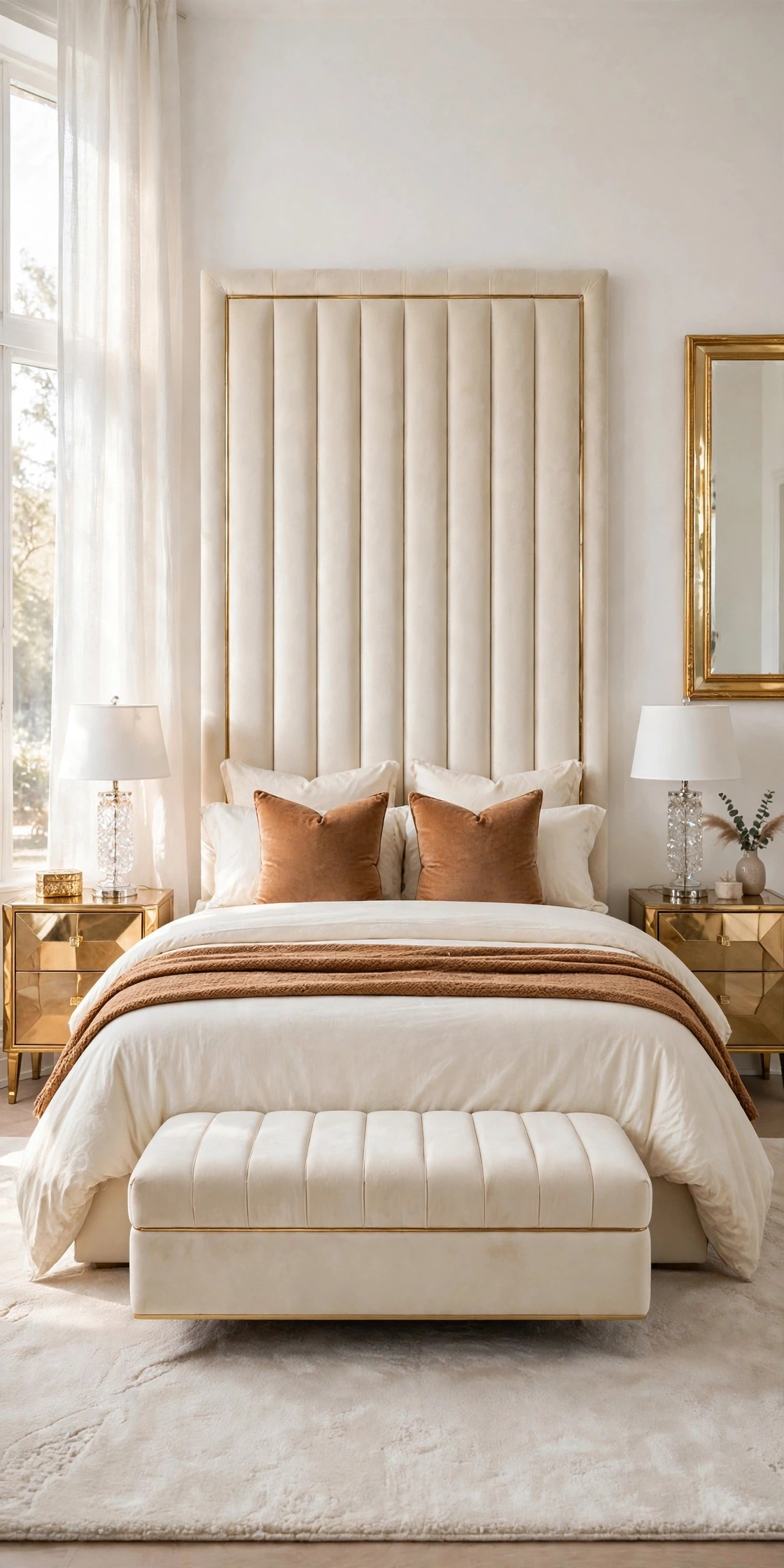
Cream and caramel is the warmest pairing in the collection, the one that makes a neutral bedroom feel like late afternoon all day. Caramel is a true mid tone, darker than taupe and warmer than tan, so against cream it creates the clearest light to dark staircase of any combination here while staying fully neutral.
Start with a full cream base, sheets, duvet, and Euro shams all in cream, because caramel needs a pale ground to glow against. Lay a caramel throw folded in a wide band across the foot, and set two caramel cushions in front, angled as a diamond pair. If the room has a bench or an ottoman, one caramel cushion there ties the bed to the room.
How to do it: Keep caramel to the foot third and the front cushions only; its strength means a little covers a lot of visual ground. Choose caramel in a texture with sheen or pile, velvet, wool, or a soft knit, since flat caramel cotton can read plain brown. Pro Tip: This is the best pairing for a bedroom with cool grey flooring, because the caramel layer warms the whole view from the door before the eye reaches the floor. Common mistake: Adding tan and caramel and brown pieces together as if they were one color. Three unmatched browns look collected by accident; one caramel, repeated twice, looks styled.
6. Ivory and Greige
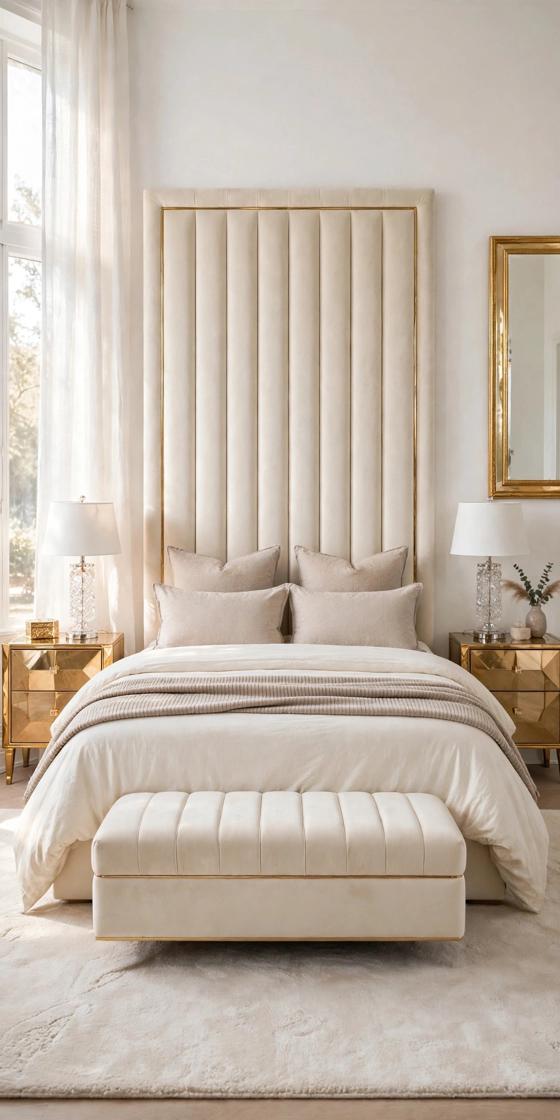
Ivory and greige suits the reader whose home mixes warm and cool finishes, because greige, the blend of grey and beige, refuses to commit to either temperature. Against ivory it reads modern and calm, and it is the easiest neutral to match across different shops, lamps, and ready made bedding sets.
Use ivory for the sheet and the duvet, the two pieces closest to the skin and to the camera. Use greige for the Euro shams and the sleeping pillow cases, so a soft grey beige frame surrounds the ivory center, and finish with a greige throw in a ribbed or woven texture at the foot.
How to do it: Decide which way your greige leans by draping it over the headboard: if it looks at home, it leans warm enough for this room. Keep metal accents to one finish, since greige beside both gold and chrome can look undecided. Pro Tip: Greige is the forgiving choice for bedding bought at different times, because small shade differences blend inside its grey beige range instead of clashing. Common mistake: Pairing greige with pure bright white sheets. The white makes greige look dusty; ivory is the partner that keeps it soft.
7. White and Warm Grey
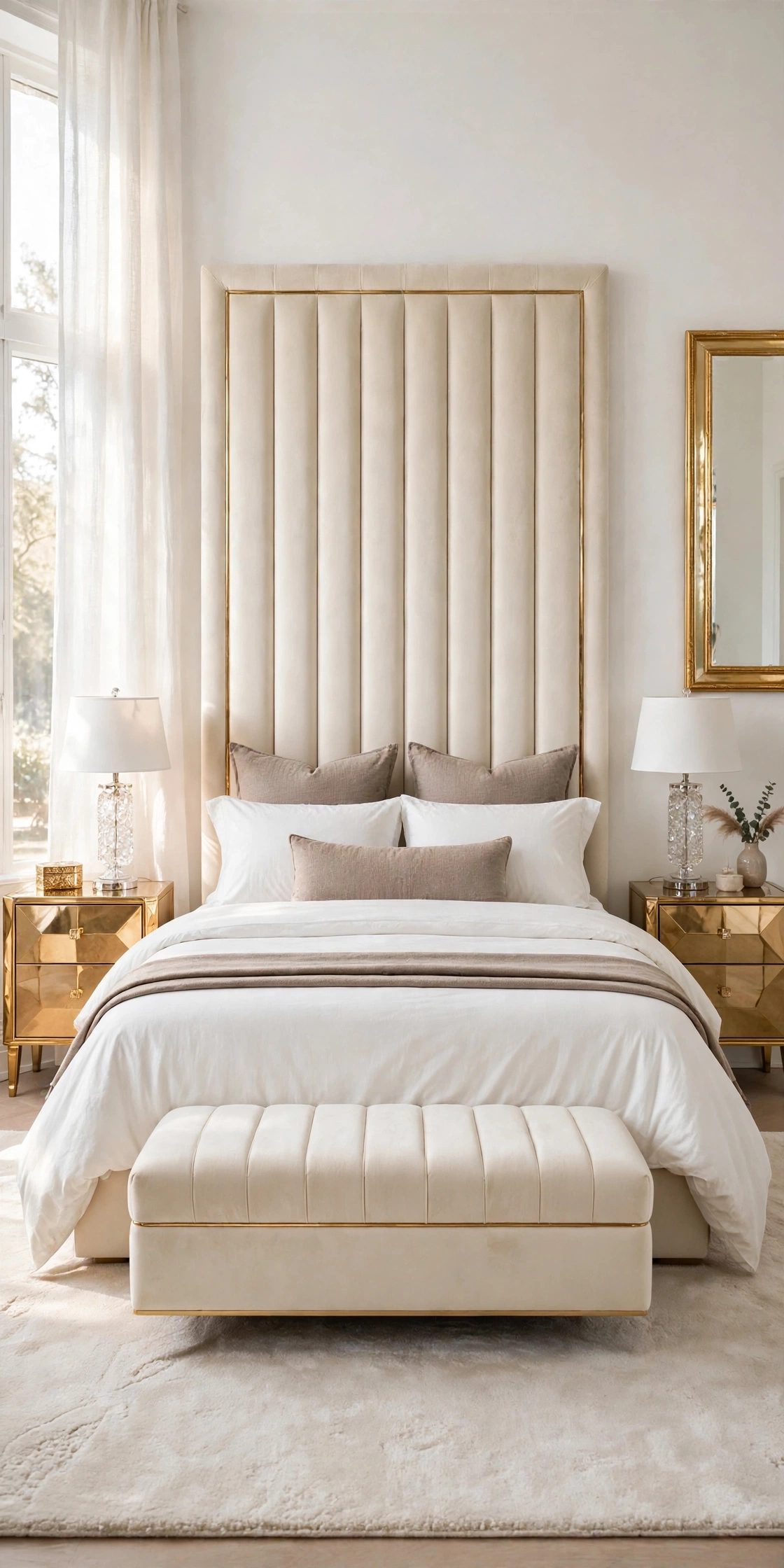
White and warm grey gives a neutral bedroom its most tailored, hotel like edge without using any black. The rule is in the word warm: a grey with a brown or beige base sits peacefully beside a cream headboard and gold lamps, where a blue based grey would turn the whole bed cold and office like.
Dress the bed in white first, white duvet folded back over white sheets, white sleeping pillows. Add warm grey as the accent set: two grey Euro shams at the back for height, one long grey lumbar cushion at the front, and a grey throw folded narrow along the foot so it reads as a clean stripe.
How to do it: Hold grey samples against something gold in the room; the right warm grey looks richer next to gold, the wrong cool grey looks bluer and cheaper. Keep the grey pieces in matte fabrics, linen or cotton, so the color stays soft instead of shiny. Pro Tip: This pairing photographs beautifully in black and white, which is the quick phone test for whether the tonal layers are clear enough. Common mistake: Grey bedding with grey walls and grey carpet all at once. Here the grey must stay an accent on a white bed, inside a warm room.
8. Cream and Oatmeal
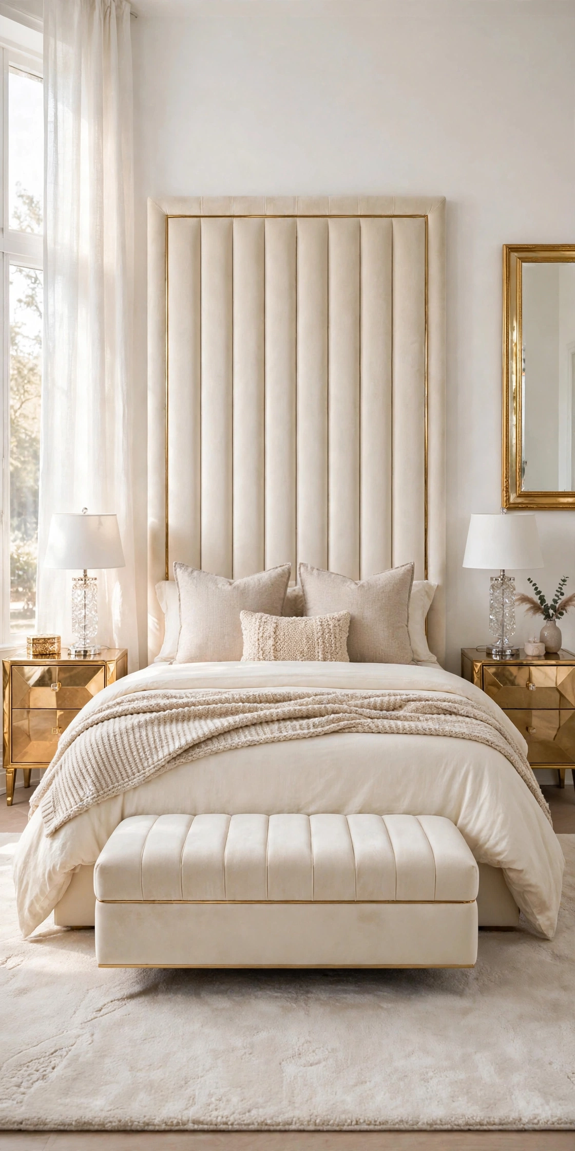
Cream and oatmeal is the texture lover’s combination, because the two colors are so close that the difference is carried almost entirely by fabric. Oatmeal, a pale, flecked, natural tone, usually comes in linen and woven cotton full of tiny slubs and threads, and against smooth cream bedding that texture becomes the decoration.
Lay cream as the smooth base: cream cotton sheets and a plain cream duvet. Bring oatmeal in on the touchable pieces, linen Euro shams with a visible weave, an oatmeal waffle or knit throw across the foot, and one small oatmeal cushion with a fringe or a raw edge at the front.
How to do it: Mix at least three textures across the bed, smooth, woven, and knitted, or the close colors will melt into one flat mass. Steam or shake the linen rather than ironing it flat; relaxed texture is the point of this pairing. Pro Tip: Oatmeal linen softens with every wash and suits warm sleepers, since linen breathes better than smooth cotton in summer. Common mistake: Choosing oatmeal pieces that are almost identical in tone and texture to the cream base. If you cannot see the layer line from the doorway, the combination is not working yet.
9. Blush and Taupe
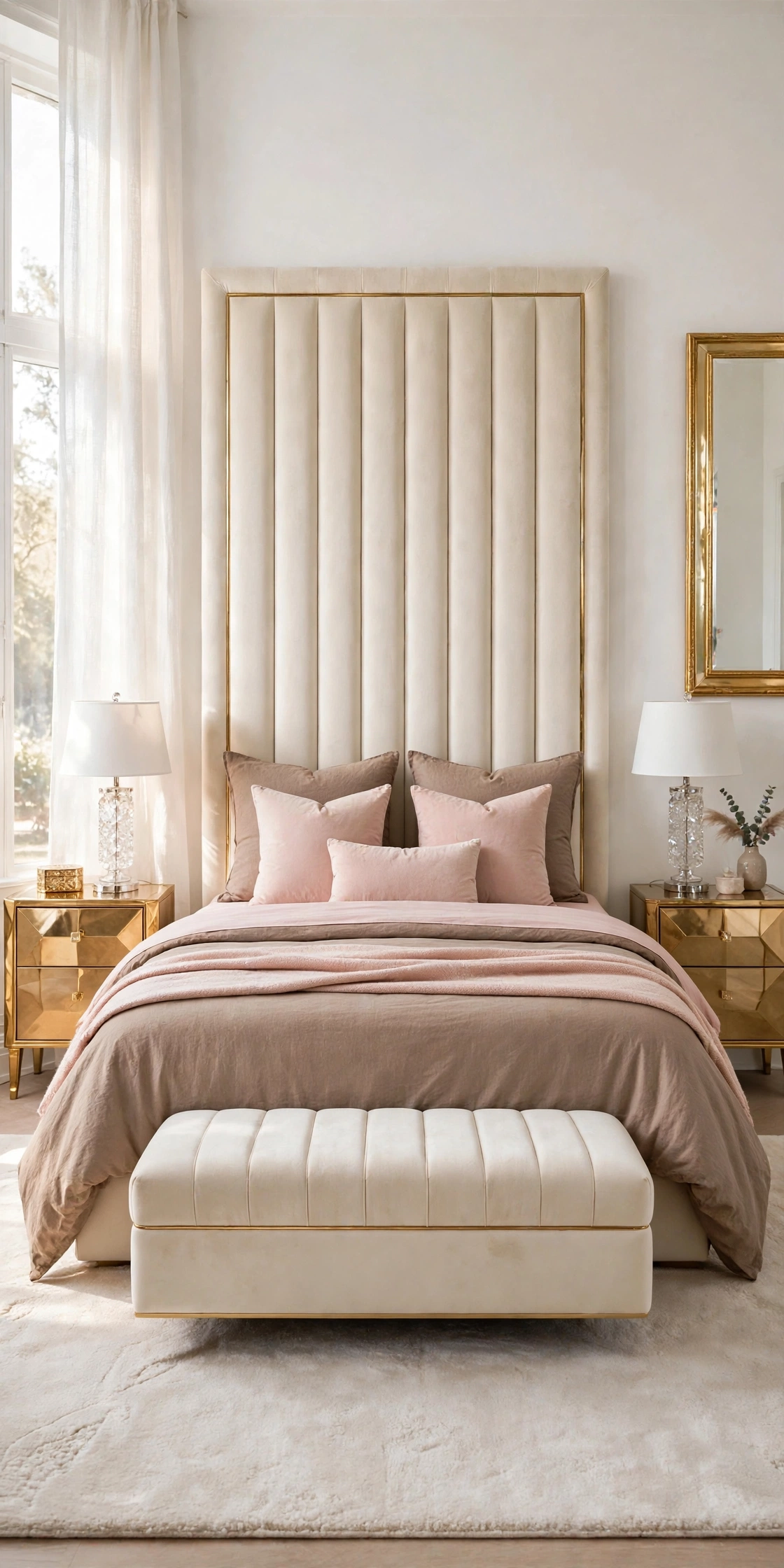
Blush and taupe is the deeper, moodier sister of ivory and blush. Taupe gives blush a grounded, grown up base, pulling the pink away from sweet and toward elegant, and the two together create the warm, rosy neutral palette that defines the glam bedrooms readers pin most.
Reverse the usual order here: let warm taupe carry the duvet and the Euro shams, the large calm ground. Add blush in the sheet fold at the top, a blush flat sheet folded over the duvet edge, plus blush cushions and a blush throw at the foot, so pink frames the taupe at both ends of the bed.
How to do it: Keep the blush dusty and the taupe warm; if either leans grey, the pairing turns dull, so test them together in lamplight, which is where this combination will mostly be seen. Add one gold or glass accent nearby, since warm metal lifts both colors. Pro Tip: This is the strongest pairing for a guest bedroom, because it feels styled and welcoming to almost every taste without committing to a bold color. Common mistake: Equal halves of blush and taupe, cushion for cushion. Taupe should own about two thirds of the bed and blush one third, or the balance tips.
10. White With Gold Accents
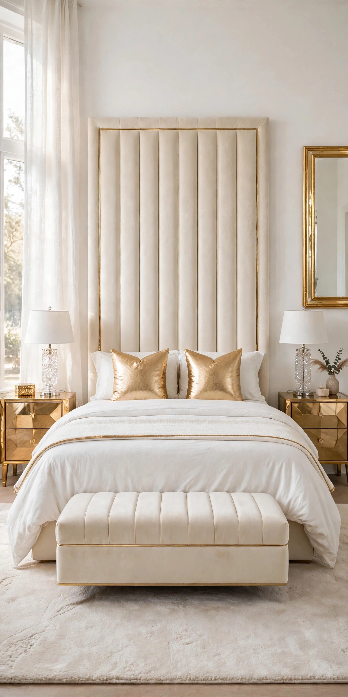
White with gold accents is not strictly two bedding colors, it is one color and one metal, and it is the signature look of the glam bedroom: a cloud of white bedding lit up by small, deliberate touches of gold. It works because the bedding stays washable and simple while the glamour lives in pieces that never need laundering.
Make the bed entirely in white: white sheets, white duvet with a subtle self stripe or a plain smooth finish, white shams. Add gold in three places only, a pair of gold cushion covers at the front, a white throw with a gold edge or a thin gold band folded at the foot, and the gold already in the room’s lamps and frames doing the rest.
How to do it: Count your gold pieces and stop at three on the bed itself; the lamps, mirror, and handles will add the rest, and gold past five touches turns glamour into glare. Wash gold trimmed pieces separately on a gentle cycle so the metallic thread survives. Pro Tip: This is the easiest combination to keep matched over years, because white bedding is always in stock everywhere, and only the small gold pieces carry the style. Common mistake: A gold duvet cover or gold sheet set. Metallic fabric on the big surfaces looks harsh, sleeps hot, and fades unevenly; gold belongs on the accents.
11. Cream and Mushroom
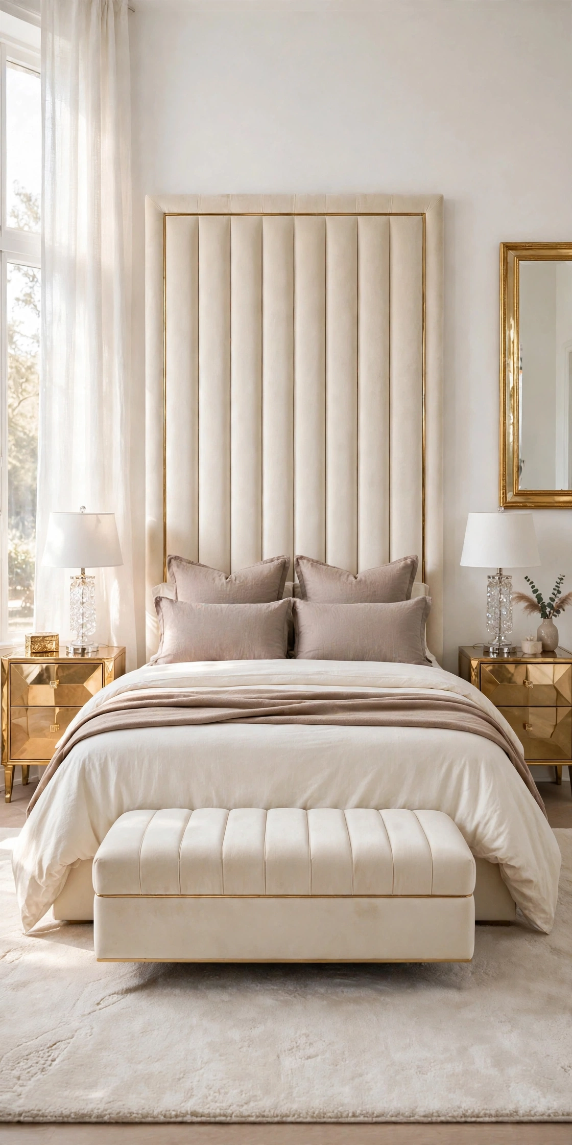
Cream and mushroom is the connoisseur’s neutral, quiet enough that many readers scroll past it, then save it on the second look. Mushroom is a soft grey brown, paler and cooler than taupe, and beside cream it gives a bed the calm, gallery like softness of a boutique hotel that uses no color at all.
Set cream sheets and a cream duvet as the warm center. Frame them with mushroom on the Euro shams and the sleeping pillow cases, so the cooler tone touches the headboard and outlines the bed, and lay a mushroom throw folded slim across the foot to close the frame at the bottom.
How to do it: Because mushroom leans cool, warm the room around it: gold lamps lit, a warm toned rug, cream rather than white walls. Check the pairing at night, since mushroom can drift grey under cold bulbs; warm white bulbs keep it in the brown family. Pro Tip: Mushroom hides makeup and hair dye marks better than any paler neutral, which makes it a practical sham color for everyday beds, not just guest beds. Common mistake: Treating mushroom and greige as the same color and mixing both in one bed. They are close cousins with different temperatures, and together they just look like a matching error.
12. Ivory and Sand
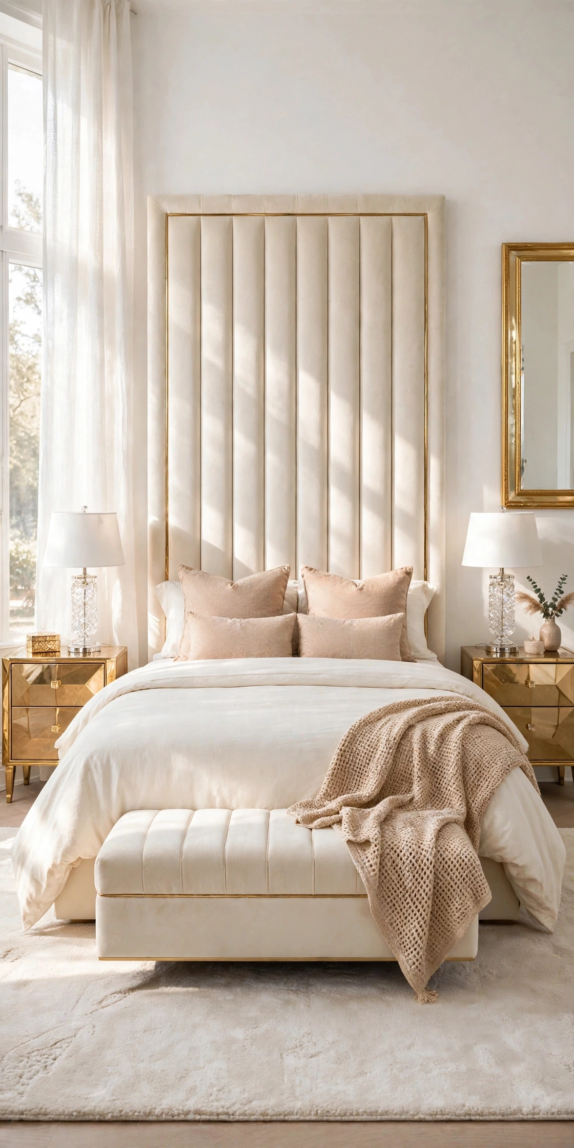
Ivory and sand brings a light coastal warmth into a neutral bedroom without a single shell, stripe, or seaside prop. Sand is a clean, sunlit beige with a yellow leaning warmth, and over ivory it creates the brightest mid tone pairing in this collection, made for rooms that face the sun.
Dress the bed in ivory sheets and an ivory duvet. Add sand on the pieces that catch the light: sand Euro shams standing tall, two sand cushions, and a sand throw in an open weave draped across one corner so sunlight plays through its texture.
How to do it: Keep the sand pieces matte and natural, linen, cotton, woven wool, because shiny sand fabrics tip toward gold and change the mood. Repeat sand once at the window, a curtain edge or a roman blind in the same family, to connect the bed to the light source. Pro Tip: This pairing makes a small bedroom feel larger in photographs, since the bright warm layers reflect light back into the room instead of absorbing it. Common mistake: Adding rattan, rope, and beach prints to push the coastal idea. The color pairing already does the work; props turn a bedroom into a theme.
13. White and Natural Linen
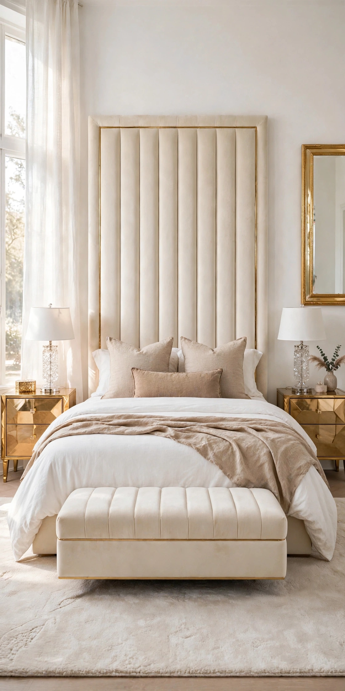
White and natural linen pairs the crispest color with the most relaxed fabric. Natural linen is the undyed, flax toned beige grey that linen starts as, full of visible fiber, and against smooth white cotton it gives a glam bed an easy, unstudied softness that keeps the room from feeling formal.
Use white for the duvet and the sheets, smooth cotton with a clean finish. Use natural linen for the Euro shams and a long lumbar cushion, and drape a natural linen throw loosely, not folded in a band, across the foot, letting its edge fall where it falls.
How to do it: Wash linen pieces before the first styling, since new linen is stiff and only gains its soft drape after two or three washes. Keep everything else on the bed smooth and simple, so the linen texture is the single relaxed note. Pro Tip: Natural linen is the most forgiving bedding color for homes with pets, because its flecked, uneven tone hides hair and light marks between washes. Common mistake: Ironing the linen flat and folding it into sharp bands. Pressed linen loses the whole point of this combination, which is the contrast between crisp white and easy linen.
14. Taupe, Blush and Cream, the Trio
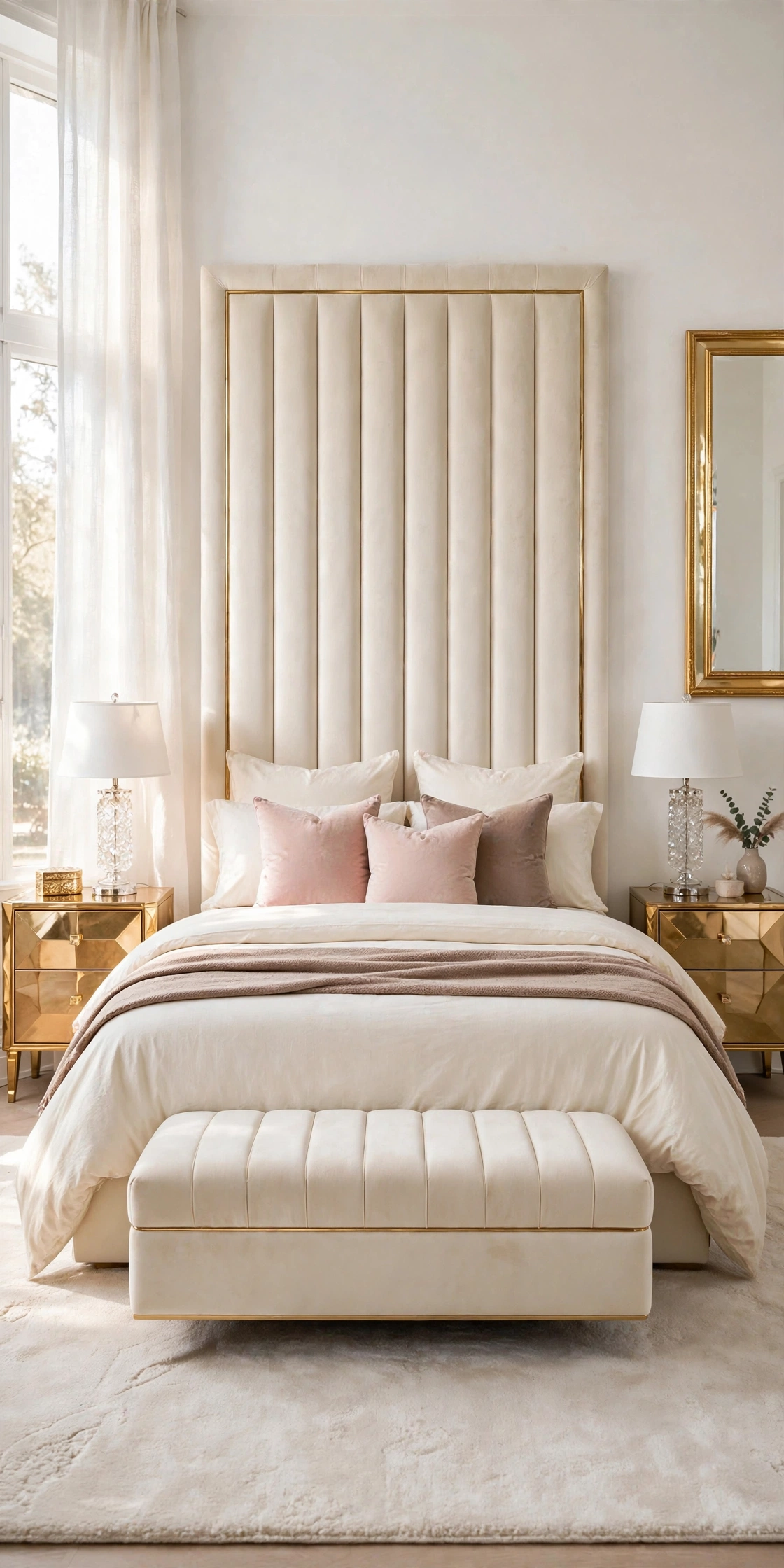
The trio, taupe, blush, and cream, is the combination to choose when two colors feel almost right but the bed still looks flat. Cream gives the light, taupe gives the depth, blush gives the warmth and the hint of color, and because all three share the same warm base, they layer without any sharp edge between them.
Build from the headboard out: cream sheets and a cream duvet as the ground. Fold a warm taupe throw across the foot as the deep band. Set blush cushions in front of the cream Euro shams, and if you own a taupe cushion, place it off to one side of the blush pair, never in the center, so the trio reads as a gradient, not a pattern.
How to do it: Hold the three fabrics together and check the order light, mid, warm: cream lightest, taupe deepest, blush between them in feeling even where it sits in front. Keep each color in at least two places, a color used once looks like a mistake, used twice it looks like a plan. Pro Tip: This trio is the best rescue for bedding bought piece by piece over time, since most stray neutral pieces fall into one of its three families and can be assigned a layer. Common mistake: Adding a fourth tone, a grey or a beige, to the trio. Three is the finished palette; the fourth color restarts the whole decision.
15. Cream and Soft Sage, the Gentle Color Guest
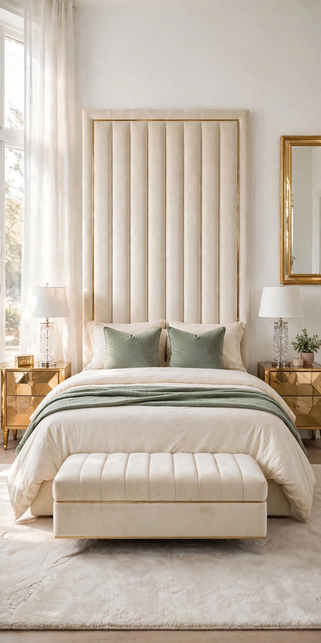
Cream and soft sage is the one place in this collection where a true color is invited in, and it earns its place because muted sage behaves almost like a neutral: greyed, dusty, and quiet. Against cream it brings the calm of a garden view into a bedroom that has none, while the cream keeps the green warm instead of chilly.
Keep the full bed in cream, sheets, duvet, and shams, unchanged. Add sage in the two front cushions and a sage throw at the foot, and repeat it once across the room, a plant on the nightstand or a sage cushion on the bench, so the guest color looks hosted, not lost.
How to do it: Choose sage with more grey than yellow; a bright or minty green will break the neutral spell instantly. Test it beside the room’s gold accents, since sage and gold together are what keep this pairing glamorous rather than country. Pro Tip: Sage is the ideal first color for a reader who fears color, because if it ever feels like too much, removing two cushions and a throw returns the bed to pure cream in one minute. Common mistake: Sage on the duvet. As an accent it is a guest; as the main cover it takes over the room and ends the neutral scheme the article promised.
16. White and Charcoal, the One Deep Contrast
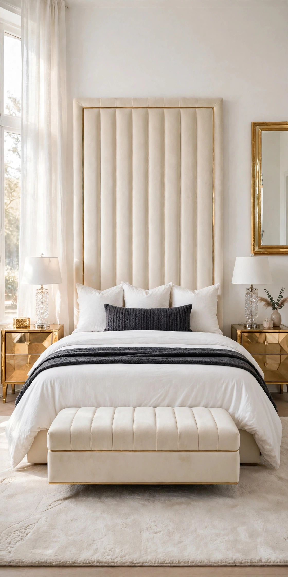
White and charcoal is the dramatic exception in this collection, the single deep contrast for readers who love neutral rooms but find all pale beds sleepy. Charcoal is softer than black, with a warm grey depth that suits the cream headboard, and against white it gives the bed a tailored, graphic outline that photographs with real punch.
Keep white in charge: white sheets, white duvet, white Euro shams, at least two thirds of everything the eye sees. Add charcoal in a long lumbar cushion across the front and a charcoal throw folded in a narrow band at the foot, so the dark color frames the lower bed without climbing toward the pillows where you sleep.
How to do it: Keep charcoal pieces in soft textures, wool, knit, brushed cotton, never shiny, because matte charcoal reads as depth while shiny charcoal reads as plastic. Add one warm piece nearby, a gold lamp or a wood tray, to stop the contrast turning cold. Pro Tip: This is the best combination for a bedroom shared by partners with different tastes, all white glamour for one, strong tailored contrast for the other, in the same bed. Common mistake: Charcoal sheets or a charcoal duvet. The contrast only works as an accent; a full dark bed swallows the room’s light and shows every speck of lint and dust.
17. All White Hotel Layers
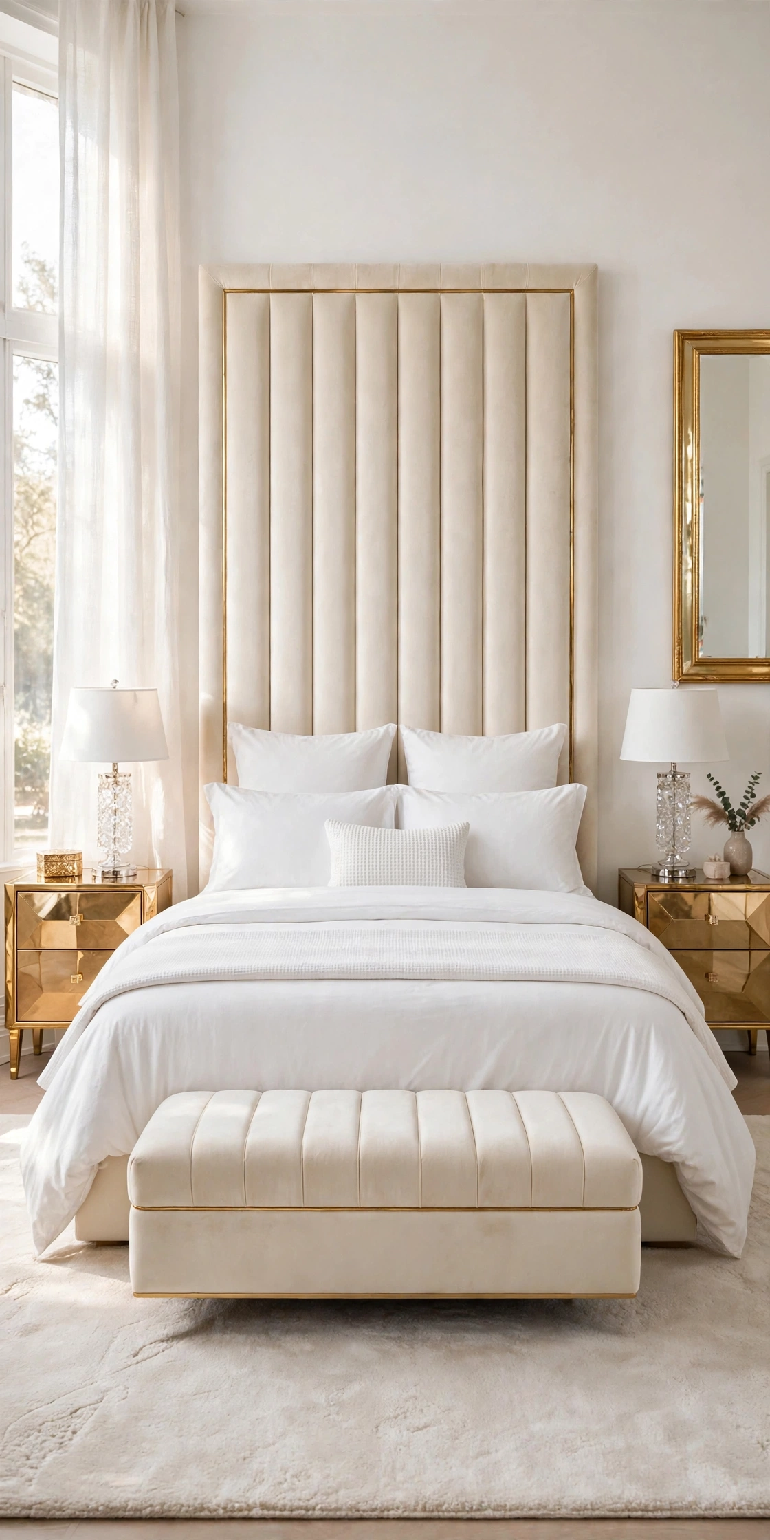
All white is the combination that looks simplest and demands the most discipline, because with no second color to hide behind, the layers themselves, their number, texture, and order, become the entire design. Done the hotel way, with triple sheeting, a duvet folded in bands, and pillows in two sizes, an all white bed reads as pure luxury.
Build it in order: white fitted and flat sheets, a white duvet folded back in a wide band to show the sheet, a second lighter white coverlet or throw folded at the foot. Stack white Euro shams upright, white sleeping pillows in front of them, and one small white cushion with a textured front, waffle, matelasse, or soft pleats, as the only relief.
How to do it: Use at least three white textures across the bed, smooth sheeting, a duvet with body, and one woven or quilted piece, because identical flat white in every layer collapses into one plain surface. Keep a stain treatment routine for the pieces, since all white only stays glamorous while it is truly white. Pro Tip: Photograph the finished bed in daylight; the camera shows yellowed or greyed pieces your eye has stopped seeing, and those pieces go to the wash or to retirement, not back on the bed. Common mistake: Buying every white piece from different ranges at different times with no plan. Whites differ, blue white, cream white, grey white, and a mixed set looks accidental; buy the visible layers as one family.
Quick Reference Table
| Combination | Where the Second Color Sits | Best For |
|---|---|---|
| White and cream | Cream duvet and Euro shams | The classic first neutral bed |
| Cream and warm taupe | Taupe throw and front cushions | Warm evening light |
| Ivory and blush | Blush cushions and throw | Soft glam guest rooms |
| White and soft beige | Beige shams and lumbar cushions | Bright, sunny rooms |
| Cream and caramel | Caramel foot band and cushions | Warming cool floors |
| Ivory and greige | Greige shams and pillow cases | Mixed warm and cool homes |
| White and warm grey | Grey shams, lumbar, foot stripe | Tailored hotel edge |
| Cream and oatmeal | Oatmeal linen shams and throw | Texture lovers |
| Blush and taupe | Taupe duvet, blush sheet fold and cushions | Moody, elegant rooms |
| White and gold accents | Gold cushions and trimmed throw | Signature glam |
| Cream and mushroom | Mushroom shams and pillow cases | Quiet boutique calm |
| Ivory and sand | Sand shams, cushions, woven throw | Sunlit, coastal warmth |
| White and natural linen | Linen shams, lumbar, loose throw | Relaxed luxury, pet homes |
| Taupe, blush and cream trio | Taupe foot band, blush cushions | Rescuing mixed bedding sets |
| Cream and soft sage | Sage cushions and throw | First step into color |
| White and charcoal | Charcoal lumbar and foot band | Strong contrast |
| All white hotel layers | Texture does the layering | Pure hotel luxury |
The Neutral Bedding Checklist
- One base color owns the sheets and duvet
- The second color sits in at least two places
- Euro shams stand upright against the headboard
- Sleeping pillows sit in front of the shams
- Front cushions carry the accent color
- The throw sits at the foot, folded or draped on purpose
- At least two textures across the bed
- No fourth color has crept in
- Undertones agree, warm with warm, cool with cool
- Whites match each other in one clean tone
- Gold stays at three touches or fewer on the bed
- Dark colors stay at the foot and the front, not the sleeping pillows
- The bed passes the doorway view test
- The bed passes the daylight photograph test
- One spare set exists for wash day
- The combination can be undone in five minutes
- Every layer would still look right on its own
Frequently Asked Questions
How many colors should bedding have in a neutral bedroom?
Two is the working answer for most beds, a base color on the sheets and duvet, and a second color on the shams, cushions, and throw. A third color, like the blush in the trio of Idea 14, works when all three share one warm base. Past three, a neutral bed stops reading as calm and starts reading as a collection, which is why every combination here stops at two, or at a planned three.
How do I stop white and cream bedding from looking yellow?
The yellow look usually comes from mixed whites, not from cream itself. Keep true whites and creams in separate layers with a clear order, wash whites together so they keep one tone, and check the bed in daylight rather than warm lamplight, which flatters everything. If a white piece has yellowed unevenly next to its partner, move it off the main bed; one tired piece makes the whole combination look aged.
Which combination is best for a small bedroom?
The palest pairings keep a small room open: white and soft beige, ivory and sand, or all white hotel layers, because they reflect light instead of absorbing it. Keep the accent color low on the bed, at the foot and the front cushions, so the tall area near the headboard stays pale and the room keeps its sense of height. The charcoal and caramel combinations are beautiful, but their deep bands sit better in rooms with light to spare.
Conclusion
A beautiful neutral bedroom is not built from one perfect bedding set. It is built from a base color you trust, a second color placed with intention, on the shams, the cushions, the throw, and the discipline to stop there. Start with white and cream if you want the classic, borrow the trio if your shelves hold mixed pieces, invite sage in for a season, or go all white and let texture do the work. The bed is the room; style its layers in order, and the whole bedroom follows.