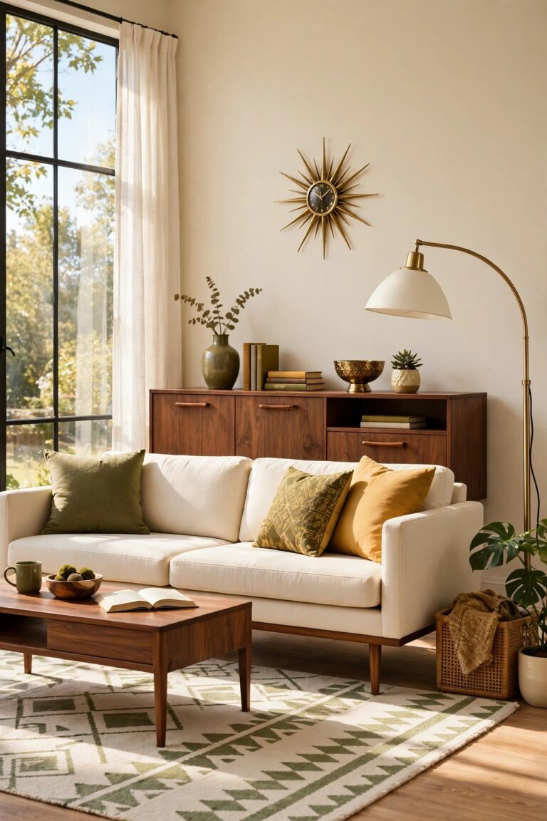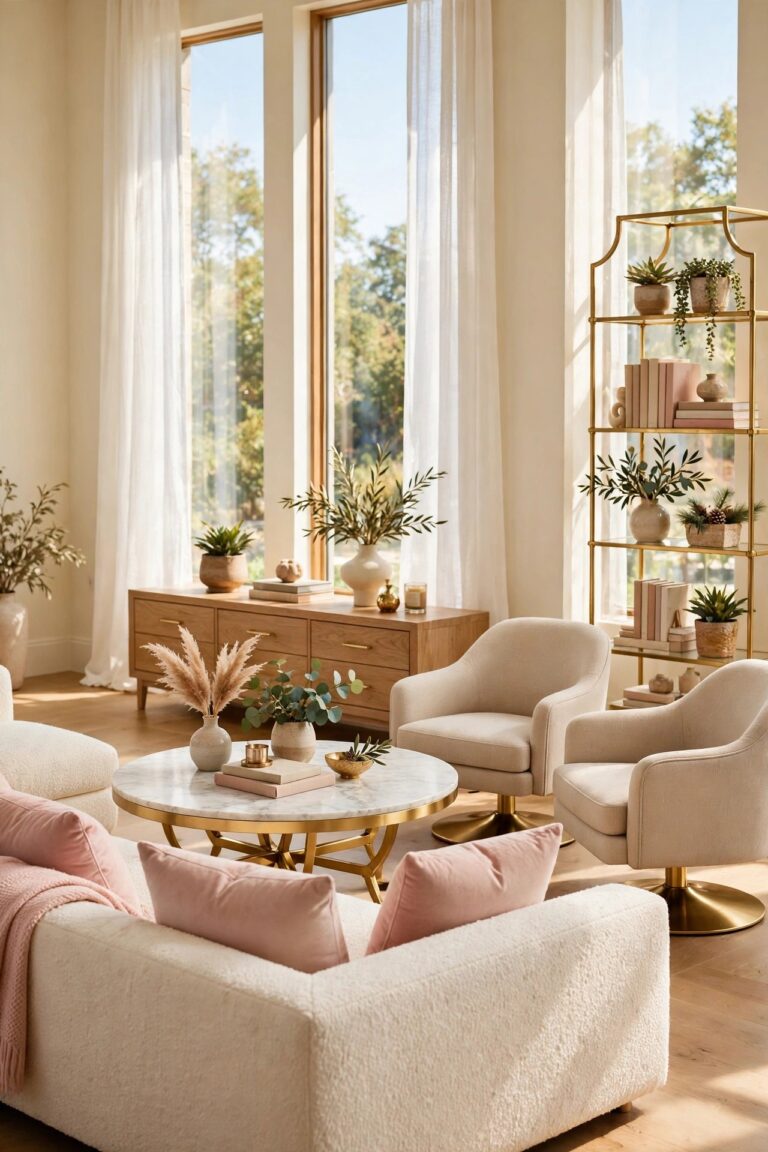
19 Pinterest Room Decor Ideas Worth Copying at Home
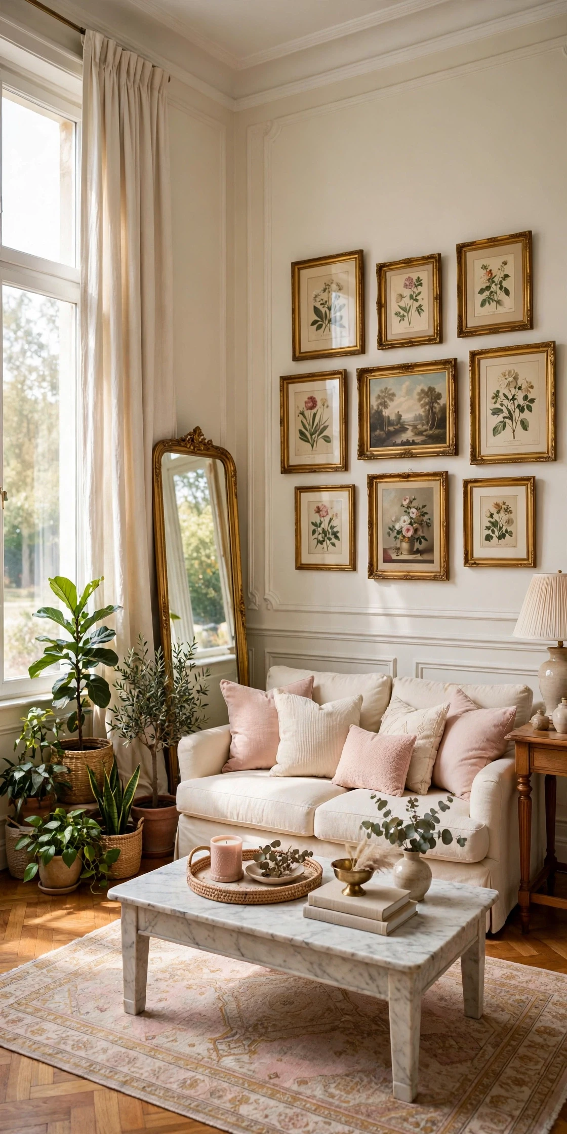
Open any saved Pinterest board and the same living rooms appear again and again: a cream sofa buried in cushions, curtains sweeping from ceiling to floor, a tall mirror leaning by the window, a coffee table tray that somehow always looks finished. They are not expensive rooms. They are rooms where a small set of decor moves has been done properly, in the right order, at the right scale.
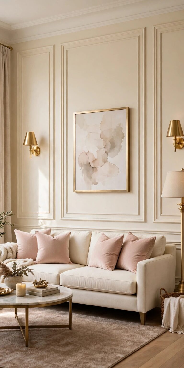
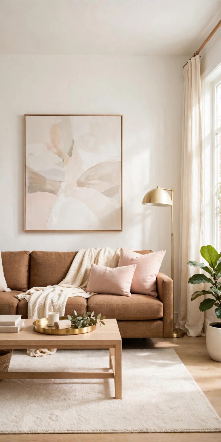
These nineteen pinterest room decor ideas take those most-saved moves apart and turn each one into real-room steps. Every idea is styled in the same bright living room, a cream sofa on a
warm taupe rug, white walls, a tall window with cream curtains, brushed gold accents, so you can see how the moves stack into one finished room instead of nineteen separate tricks.
1. Layer Textiles in Threes on the Sofa
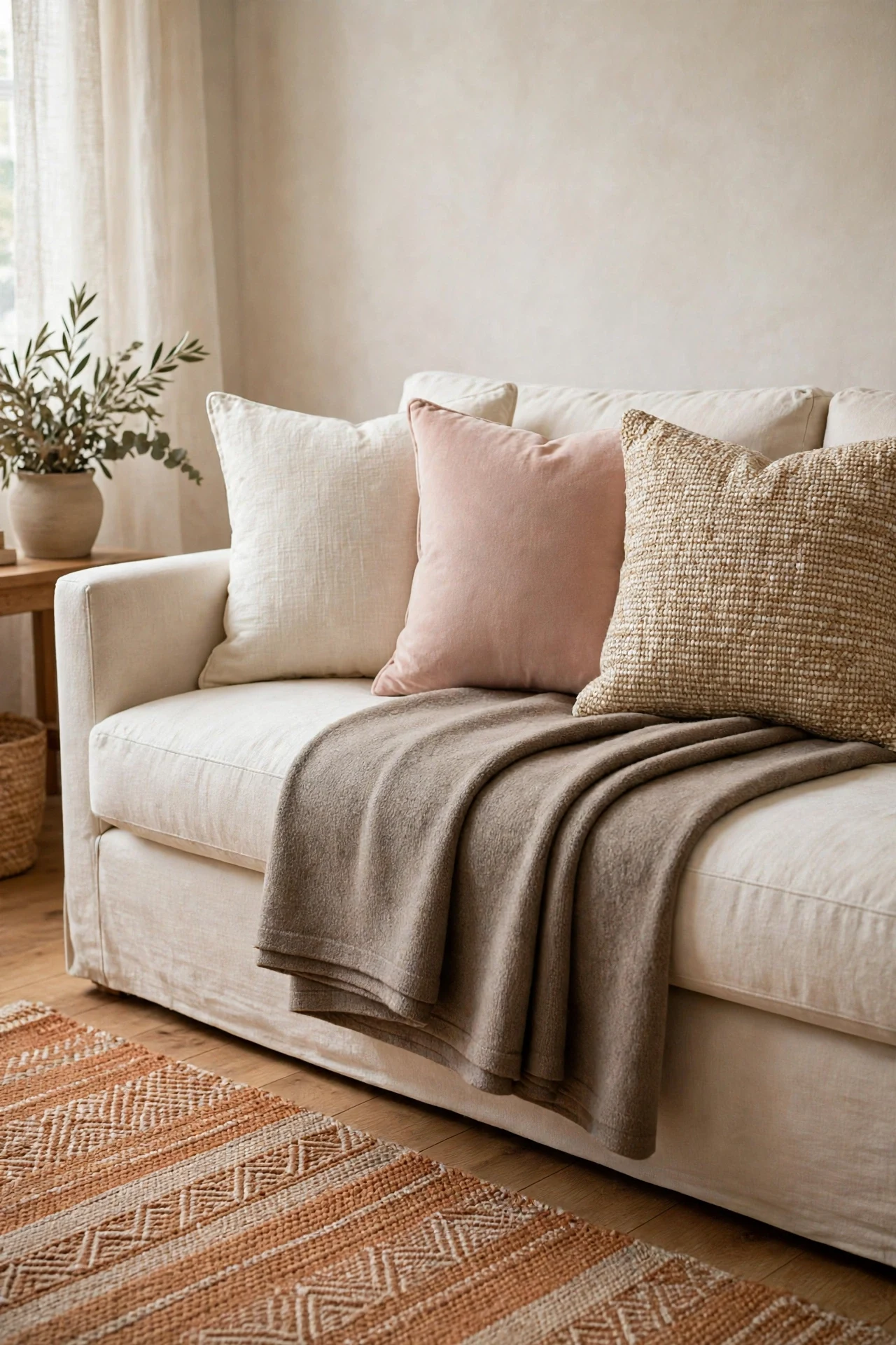
The most-saved sofas on Pinterest all share one habit: nothing on them is single. Cushions come in a group, a throw is folded over them, and the group follows a count the eye can read, usually three textiles deep. A bare sofa, however good its shape, photographs like furniture in a showroom. The same sofa with three layered textiles photographs like a home someone styled on purpose.
Three is the count because it gives the eye a beginning, a middle, and an end: a large plain cushion at the back, a smaller patterned or textured one in front of it, and the throw folded across the arm or the seat edge as the third layer. Keep the three inside one palette, cream, warm taupe, and blush in this room, and let texture, not color, make them different: linen, a woven stripe, a soft knit.
How to do it: Start with the largest cushions at the back corners, angled slightly toward the room. Set the smaller cushion in front of one stack, off center, and fold the throw in a long band over the opposite arm or across the seat. Step back and check the sofa reads as layers from the door, not as a pile. Fluff and re-fold weekly; layered textiles slump fast. Pro Tip: If your sofa is a strong color, keep all three textiles in pale neutrals; the contrast of calm layers on a bold sofa is exactly the saved-photo effect. Common mistake: Five cushions in five patterns. The rule is three layers deep, in one palette; more than that reads as storage, not styling.
2. Hang Curtains High, Wide, and to the Floor
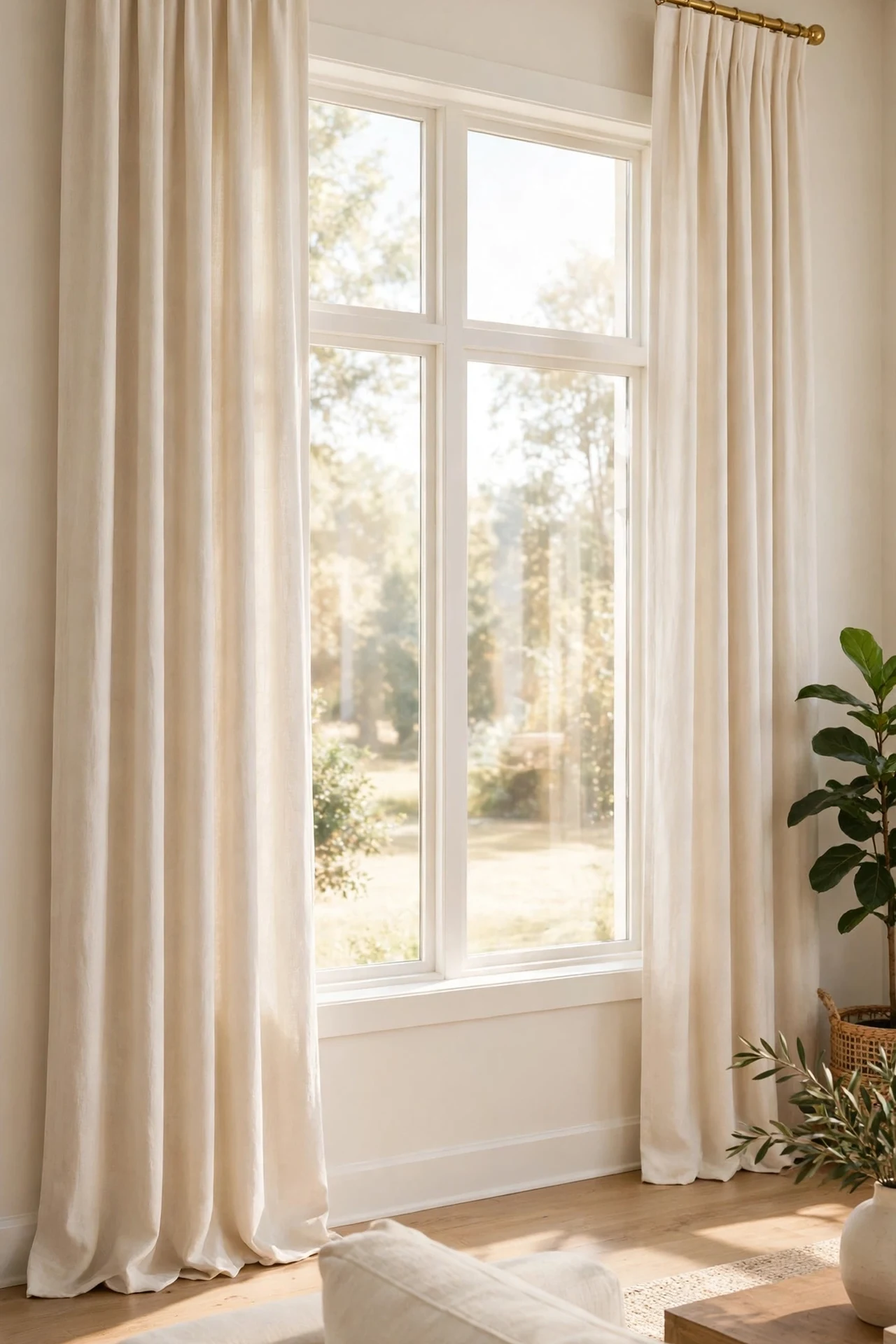
If one decor move appears in nearly every viral living room, it is this one. Curtains hung a few inches below the ceiling, on a rod wider than the window, falling all the way to the floor, make the ceiling look taller, the window look bigger, and the whole wall look designed. The same window with a short curtain at frame height makes the same room look rented, and the difference costs nothing but a moved rod.
The mechanics are simple. Height draws one long line from ceiling to floor, and the eye reads that line as ceiling height. Width keeps the open fabric resting on the wall instead of covering the glass, so the room keeps its daylight and the window gains the wall space on both sides. Floor length is non-negotiable: a hem floating above the floor announces the shortcut from across the room.
How to do it: Move the rod to just below the ceiling or crown molding and extend it well past both sides of the frame. Rehang curtains so the hem just touches the floor or breaks slightly on it; let down a hem or add a plain band of matching fabric if yours come up short. Keep the fabric inside the room’s palette, cream or warm white here, and let the sofa carry the color. Pro Tip: A simple brushed gold rod that matches the room’s other gold touches makes the curtain wall feel planned rather than patched. Common mistake: Raising the rod but keeping curtains that end at the sill. The high rod only advertises the short hem; length must change with height.
3. Build a Gallery Wall With One Frame Color
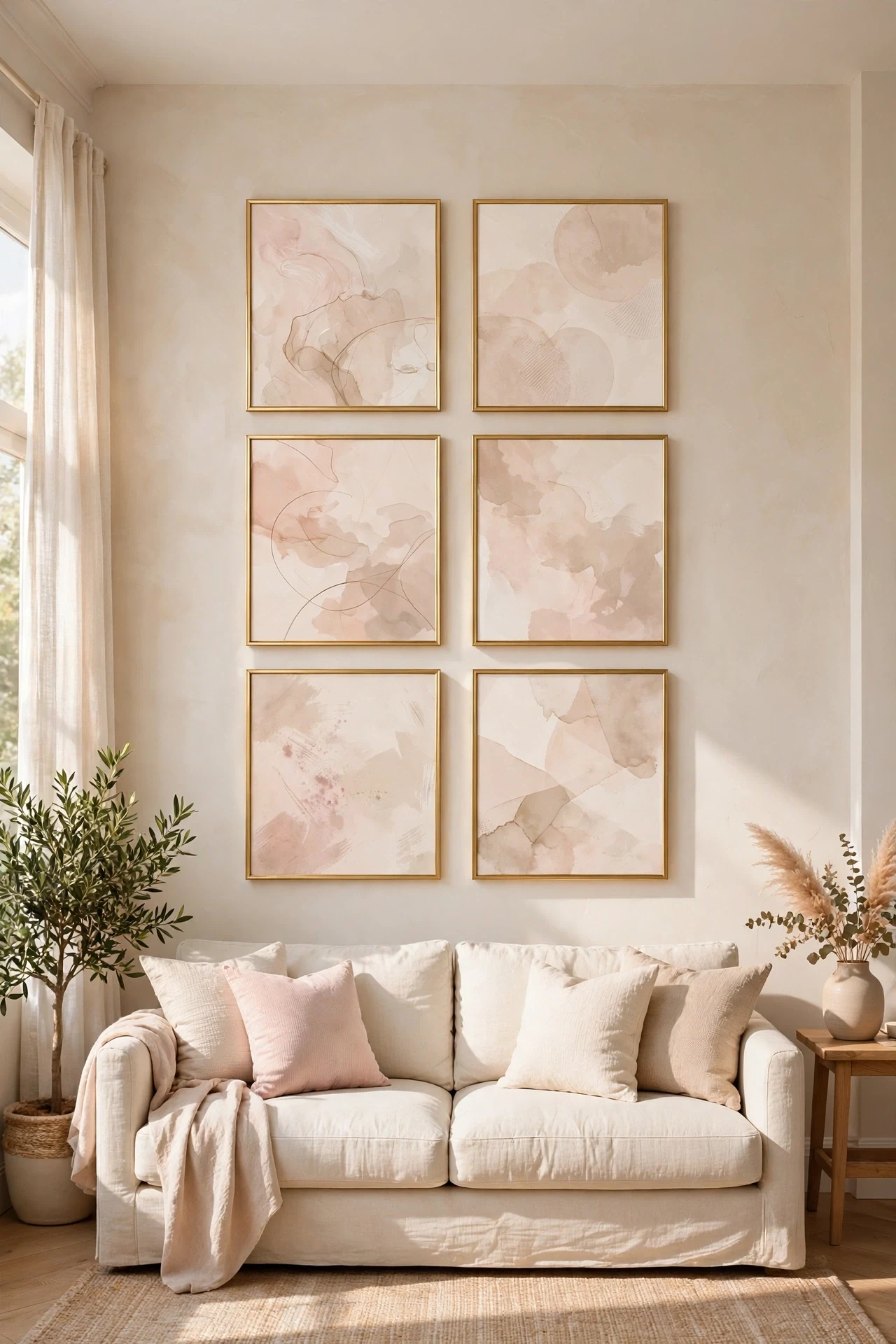
The gallery walls that get saved are never the ones with twelve random frames. They are the ones where every frame matches, thin gold, natural wood, or black, and the art inside stays inside one soft palette. One frame color turns a group of prints into a single piece of furniture for the wall, calm and deliberate, where mixed frames turn the same prints into a flea market.
Layout follows one of two saved formulas. A grid, two or three rows with even gaps, suits modern rooms and symmetrical sofas. A loose cluster with one shared line, all tops or all centers aligned, suits a more relaxed room. Either way, the group should be sized to the furniture below it, roughly two thirds of the sofa’s width, and hung as one block, lower than most people hang it, with the bottom edge a hand’s span above the sofa back.
How to do it: Lay the whole arrangement on the floor or a bed first, at the exact size of the wall block, and photograph it before any nail goes in. Keep gaps even, about a finger’s width times two, and cut paper templates to tape on the wall if you want a second check. Choose prints in one palette, soft abstract, line art, or muted photography, and let one slightly larger piece anchor a corner. Pro Tip: Prints you already own in other rooms often make the best gallery; shop your own walls first and buy only the frames to unify them. Common mistake: Hanging the group too high and too small, floating near the ceiling. A gallery wall belongs to the sofa below it, close enough to read as one arrangement.
4. Lean a Large Mirror Where It Bounces Light
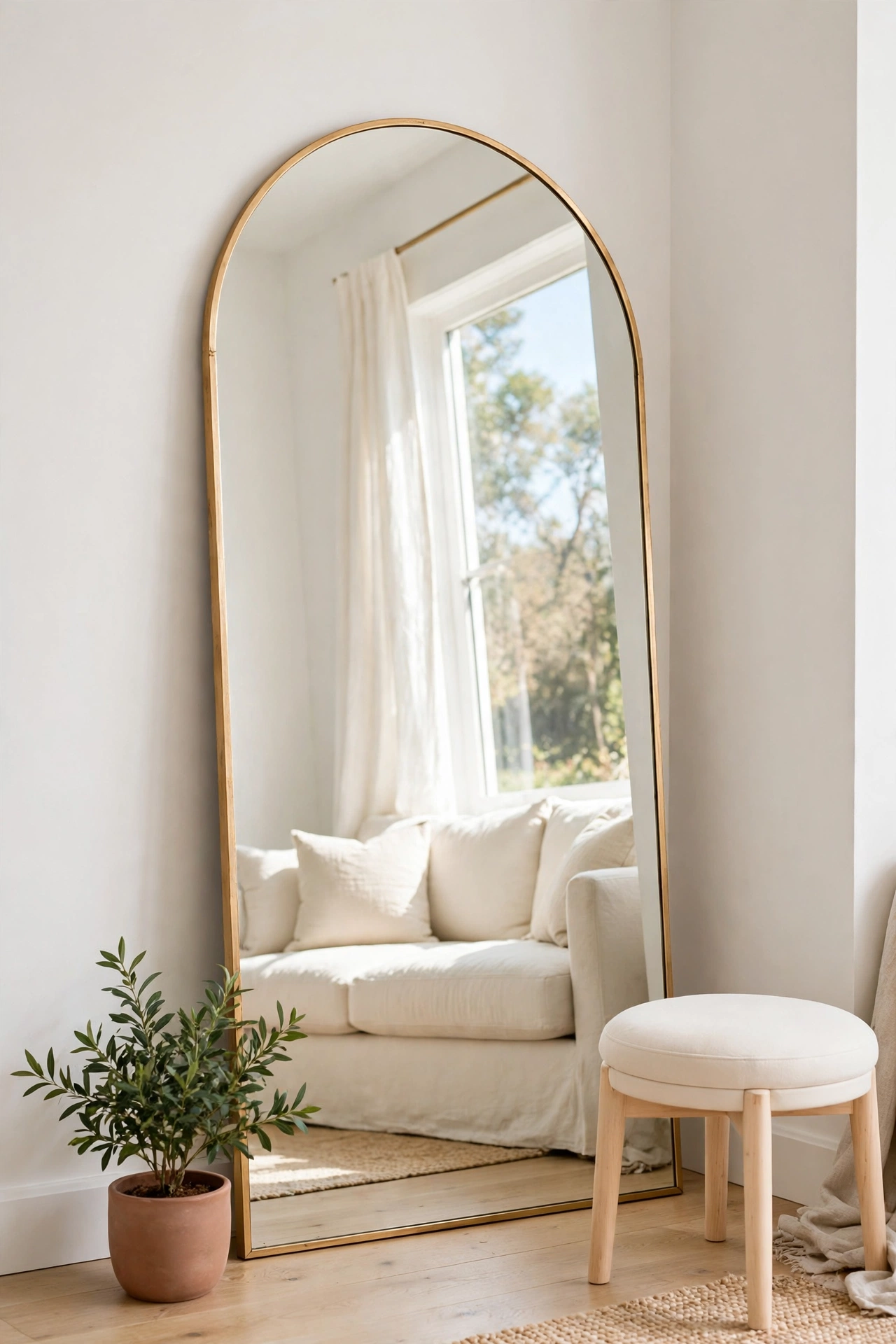
A tall mirror leaning against the wall is a Pinterest signature because it does three jobs at once: it doubles the room’s light by reflecting the window, it fills a tall bare wall without a single nail at height, and its lean gives the room the relaxed, styled feeling that hung mirrors rarely achieve. The gold frame version is the one saved most often in glam rooms, since the warm metal doubles as the wall’s jewelry.
Placement decides what the mirror does. Lean it on a wall that faces or sits beside a window, so it reflects light and greenery or sky, never a blank wall or a cluttered corner, because a mirror multiplies whatever it shows. Oversized is the point: a mirror that reaches most of the way up the wall reads as decor; a small one reads as a bathroom leftover. Safety is part of the styling, since a leaning mirror must be secured at the top with a strap or bracket, especially in homes with children or pets.
How to do it: Choose the largest mirror your wall and budget allow, in a frame that matches the room’s metal. Set its base a few inches out from the wall and lean it back, then fix a discreet anti-tip strap from the frame to a wall stud. Check the reflection from the sofa: adjust the angle until it shows window light or the plant corner, not the television or the door. Pro Tip: A mirror opposite the plant corner doubles your greenery for free, the oldest trick in the saved-photo book. Common mistake: Leaning a mirror unsecured. The lean is a look, not a risk; strap it before you style around it.
5. Style a Tray on the Coffee Table
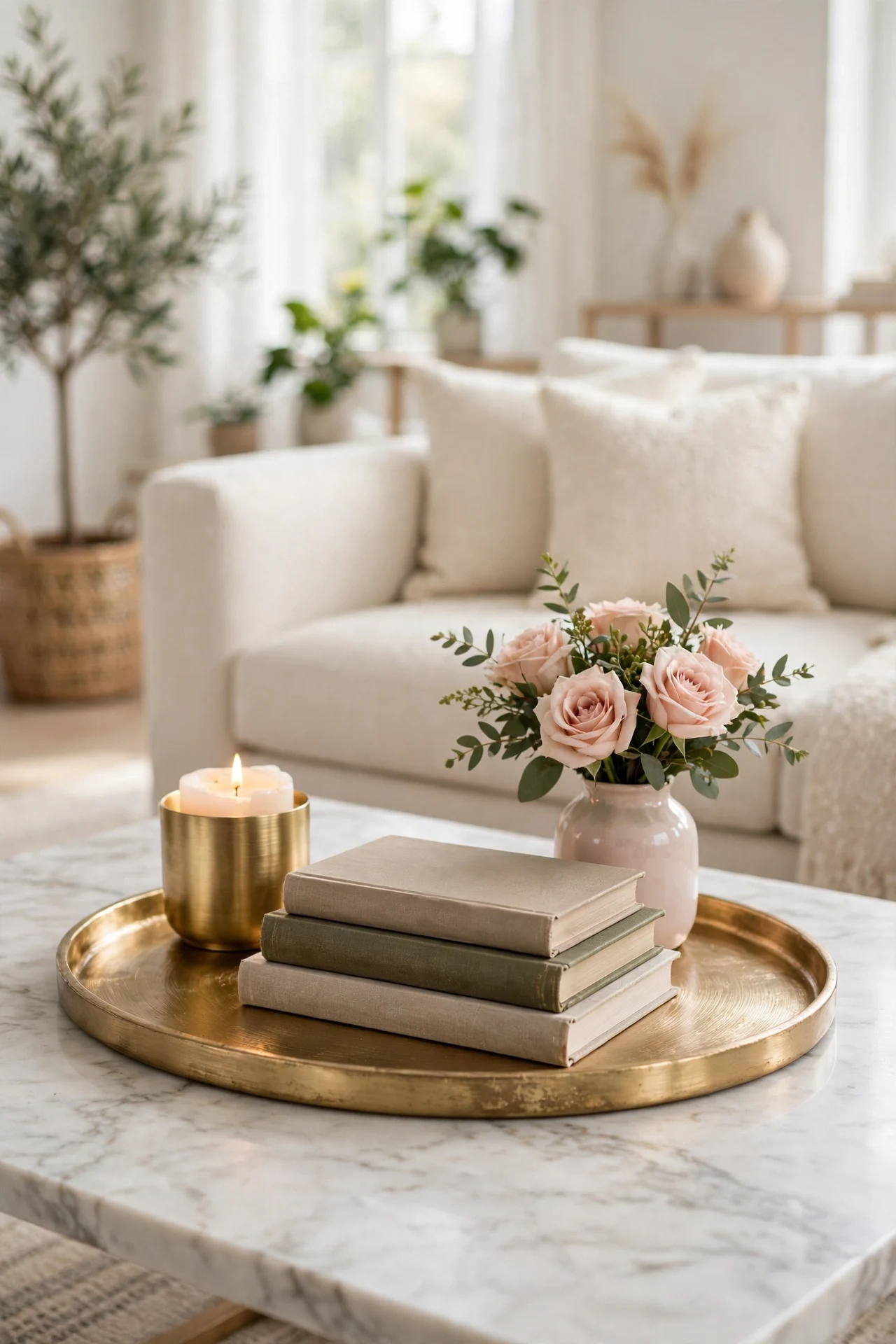
The coffee table tray is the most copied styling move on the platform, because it solves the table’s real problem: without a border, everything on it spreads, remotes, cups, chargers, mail, until the table is a landing strip. One tray draws a line the eye understands. Inside the tray is the display; outside it, the table stays clear for feet, games, and actual coffee.
Inside the border, the saved formula is a small group of three heights: a flat stack of two books lying down, one medium object such as a candle or a small bowl, and one tall soft thing, a small vase with stems or a tiny plant. That is the whole arrangement, and it works on any table because the heights do the decorating. The tray itself should suit the room, brushed gold in this palette, marble, or warm wood, with a low edge that reads as intention.
How to do it: Size the tray to about a third of the table so clear table remains on every side. Build the group tallest at the back, books flat, vase behind them, candle in front, and leave one corner of the tray empty for a cup in real life. Lift the whole tray off to clean or use the table, and set it back exactly; that portability is why the styling survives ordinary weeks. Pro Tip: The tray is the only place new small pretty objects may land. When it looks full, something leaves before anything joins, and the table stays styled forever. Common mistake: A tray so large it becomes the tabletop. The border stops meaning anything, and clutter simply moves inside a bigger fence.
6. Create a Plant Corner in Odd Numbers
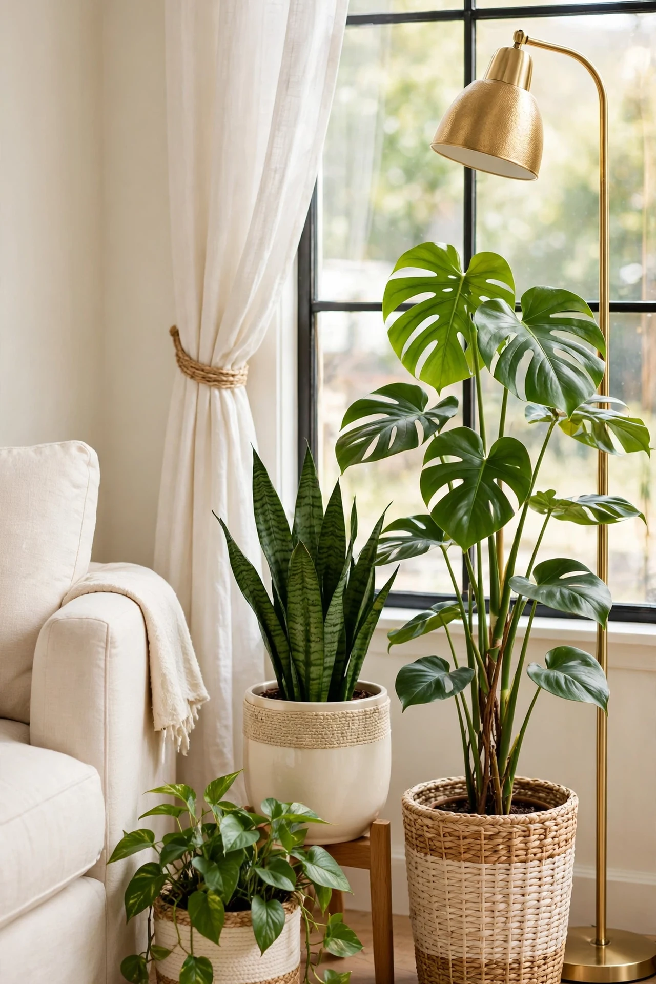
Saved living rooms almost always have one green corner, and it follows a formula hiding in plain sight: plants in odd numbers, usually three, at three different heights. One tall plant on the floor, one medium plant on a stand or stool, one small or trailing plant higher up or hanging. The triangle of heights is what makes it look designed; three plants in a row on the floor looks like a shop shelf.
The corner does practical work too. It softens the one hard angle every room has, fills the dead space beside a sofa or window, and gives the mirror something worth reflecting. Keep the pots inside the palette, cream, warm terracotta, woven baskets, so the green stays the only color event. Choose plants for the light the corner actually gets, not the light you wish it had; a thriving plain plant photographs better than a rare one dying beautifully.
How to do it: Start with the tall plant in the corner itself, in the largest pot. Add the medium plant on a low wood stand or a stack of books to lift it clear of the floor line, then the small trailing plant on a shelf edge or hanging hook where its leaves can fall. Group them close enough to read as one corner, with a little air between pots. Water on one fixed day, and turn the pots a quarter each week for even growth. Pro Tip: If real plants fail for you, use one good faux tall plant and keep the smaller two real and easy, herbs or a pothos; the mix reads as real at room distance. Common mistake: Scattering single plants around every room surface. The corner concentration is the look; singles everywhere just look like errands.
7. Layer Light at Three Heights
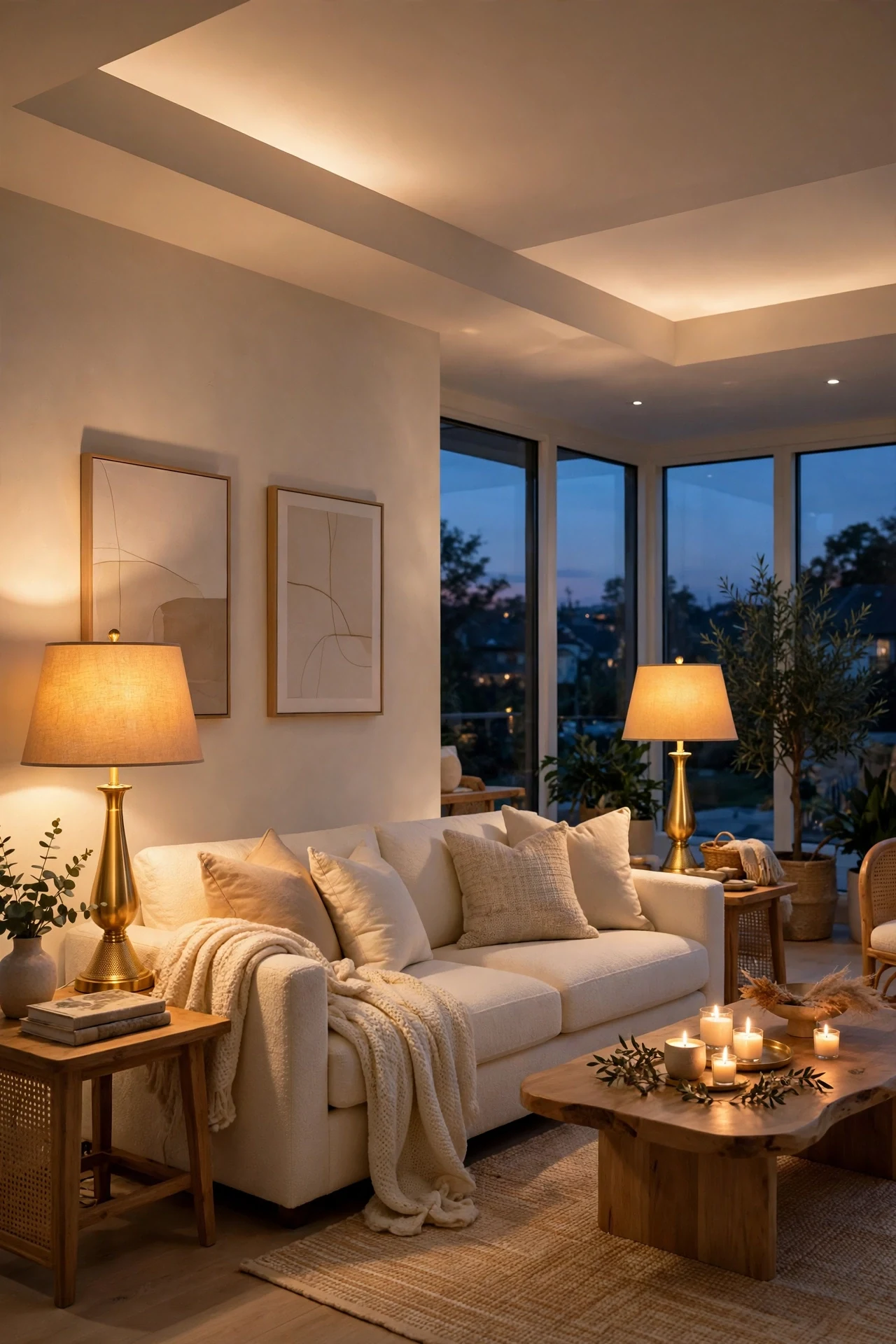
Daytime rooms get saved for their windows; evening rooms get saved for their light layers. The formula is three heights of warm light: a soft ceiling source for general glow, lamps at sitting height on side tables or a console, and one low source, candles or a small lamp near the floor line, for the pool of light that makes a room feel sheltered after dark. Rooms lit by one overhead light never appear on the boards, because that single source flattens everything it touches.
Agreement matters as much as placement. Every bulb should be the same warm white, so cream furniture glows one color instead of three. Lamps in pairs bring the symmetry glam rooms love, one on each side of the sofa or console, and their shades should match in color even if the bases differ slightly. The low layer is the flexible one: a candle cluster on the tray, a small lamp on a low shelf, or a lantern by the plant corner.
How to do it: Fit warm white bulbs everywhere first. Set the lamp pair at sofa height next, matching shades if the bases differ. Add the low source last and judge the room from the sofa at dusk, adjusting brightness until the lamps do the work and the ceiling light is only support. Keep one spare warm bulb in a drawer so a replacement never breaks the match. Pro Tip: Put the ceiling light on a dimmer and let it drop to a glow in the evening; boards-worthy rooms are lit from the sides, not from above. Common mistake: Mixing a daylight bulb into one lamp because it was in the drawer. In a room this pale, one cool bulb turns half the sofa blue.
8. Use the Two-Two-One Cushion Formula
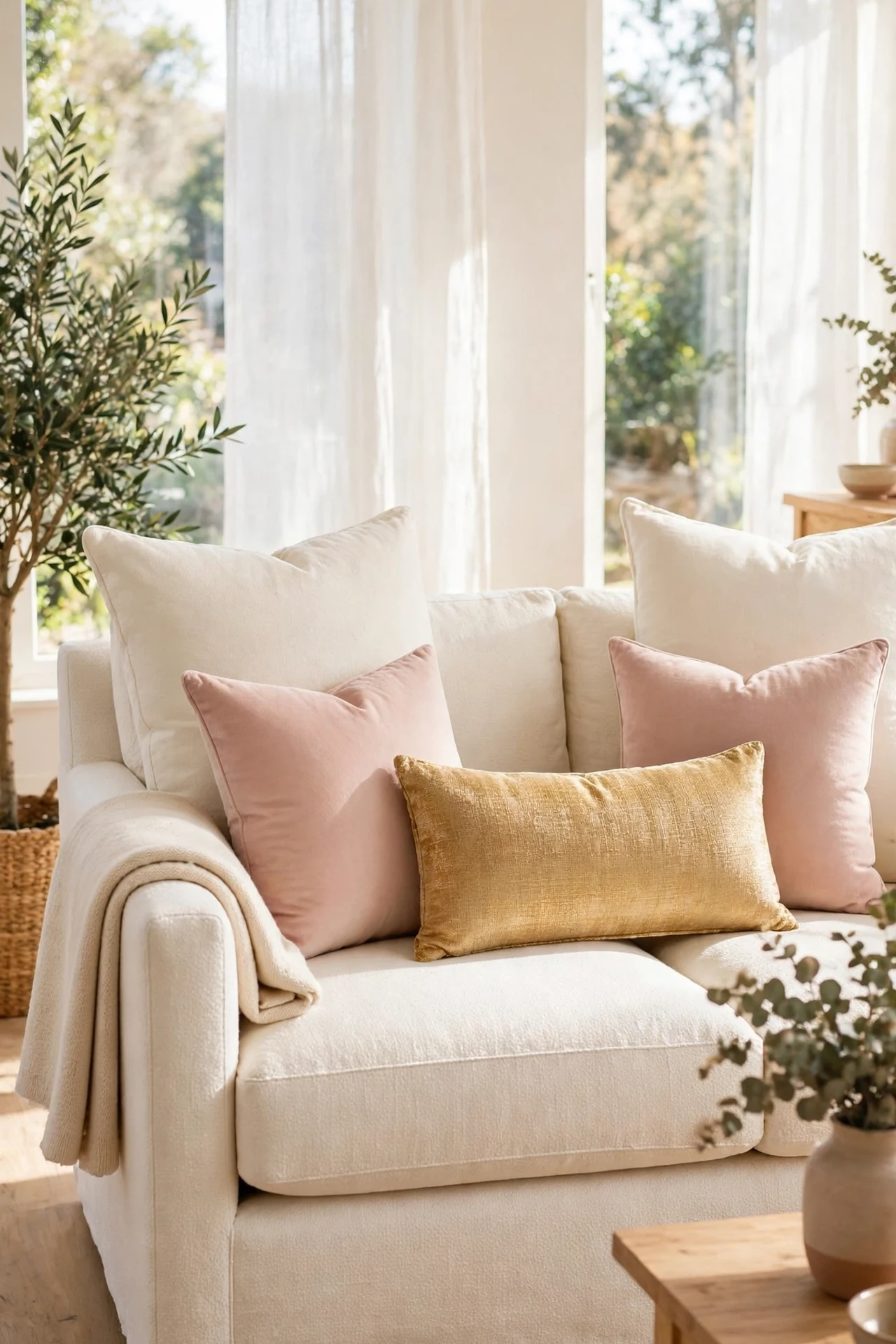
Where Idea 1 layers textiles loosely, this is the stricter formula behind the most formal saved sofas: two large cushions, two medium, one long lumbar, arranged like steps down to the center. It works because the eye reads a pattern instantly, and a patterned sofa looks finished even in a plain room. The lumbar, the single different shape, is the full stop at the end of the sentence.
Keep the five inside the palette with the pattern carried by texture. In this room: large cream cushions at the back, blush in the middle size, and the lumbar in gold or a woven stripe as the one accent. Symmetry is the point here, both sides matching, which suits sofas centered on a fireplace, a console, or the gallery wall. If your sofa sits off center in an open plan, use Idea 1’s looser layering instead; the formula needs a centered stage.
How to do it: Place the two largest cushions upright at the back corners, plumped with a karate chop crease at the top center. Set the medium pair in front of them, then the lumbar dead center in front, and step to the door to check the steps read evenly. At night, move the lumbar to a chair rather than the floor, so the formula greets you intact in the morning. Pro Tip: Buy cushion covers, not cushions, when you change seasons; the five inserts stay, and blush for spring can become taupe for fall in one zip. Common mistake: Two-two-one in five clashing prints. The formula supplies the order; the palette must supply the calm.
9. Keep a Woven Basket of Throws Within Reach
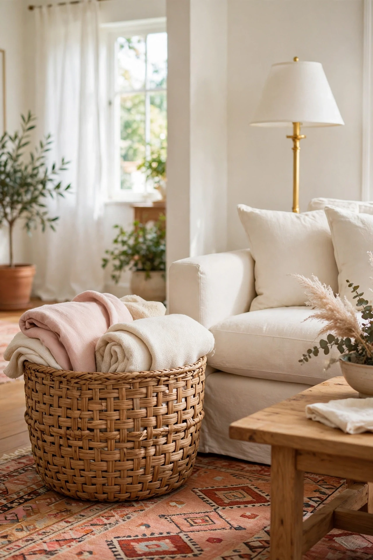
Every cozy saved photo hides this basket somewhere in frame: a large woven basket beside the sofa, holding the throws that make the room look soft. It is decor and storage in one object. The throws are the room’s warmth made visible, folded so their edges and one blush tone show, and the basket keeps them styled instead of draped over every arm and back cushion, which is where throws go to look untidy.
The basket also makes coziness honest. A room that invites you to curl up needs the blankets reachable, and a basket at the sofa’s side puts them within arm’s reach while keeping the sofa’s styling intact. Size it generously; a basket that holds three or four folded throws reads as a design piece, while a small one reads as a bin.
How to do it: Choose a sturdy woven basket with handles, in a natural tone that suits the rug, and place it at the sofa’s end, on the side nearest the lamp. Fold throws lengthways and stand them upright in the basket so their folded edges show in a row. Keep the palette tight, cream first, one blush, one taupe, and wash or shake them out on the same day you clean the room so the basket never becomes a laundry holding zone. Pro Tip: In summer, swap the heavy throws for two lightweight cotton ones and roll a spare cushion cover into the basket instead; the basket stays full and styled in every season. Common mistake: Draping every throw over the sofa and keeping the basket empty. One styled drape is a look; four is a mess with a basket beside it.
10. Give the Sofa a Rug That Reaches the Furniture
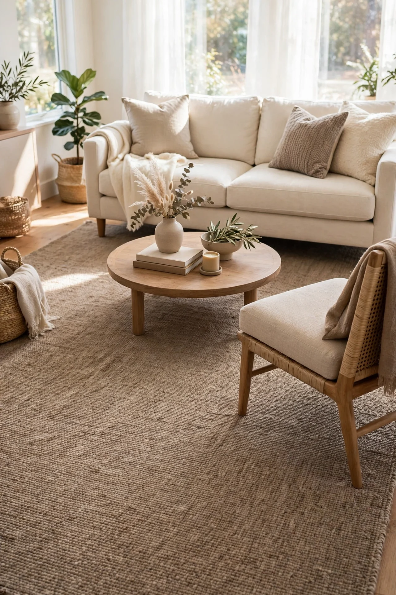
Ask what separates saved rooms from ordinary ones and designers give an unfashionable answer: the rug is big enough. In the saved photos, the rug reaches under the front legs of the sofa and the side chairs, tying the whole seating group into one island. In ordinary rooms, a small rug floats under the coffee table alone, and the furniture stands around it on bare floor like strangers at a bus stop.
The rule is reach, not price. Front legs of every seat in the group on the rug, back legs off, is the classic arrangement, and it works in small rooms too, where a wall-to-wall-feeling rug actually makes the room read larger. Color follows the palette: a warm taupe or cream rug with a subtle woven pattern grounds the pale sofa without competing with the cushions above it.
How to do it: Measure the seating group, not the room: the rug should extend at least a few inches beyond the sofa’s sides and reach under the chairs’ front legs. If you are between sizes, go larger; a too-big rug looks generous, a too-small one always looks like a mistake. Use a thin non-slip underlay to keep the edges flat. If a new rug is not possible, layer the one you own over a larger plain flat weave in a matching tone, the layered-rug look is itself a saved move. Pro Tip: Tape the rug’s outline on the floor before buying. Living with the tape for a day shows you exactly how the island will feel. Common mistake: Centering a small rug on the coffee table and pushing the sofa off it. The table is the last thing the rug needs to hold; the seats come first.
11. Style Open Shelves by Thirds
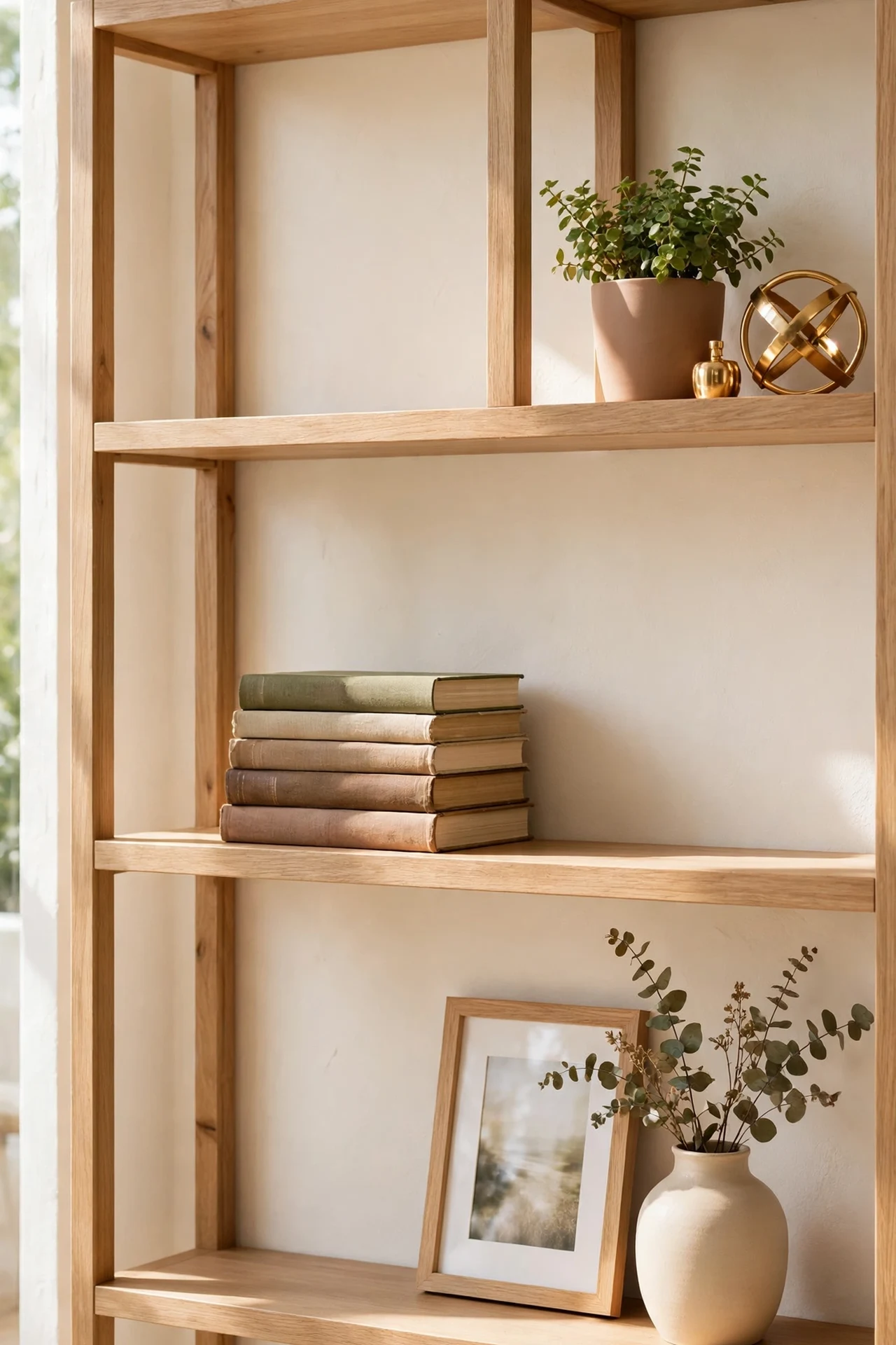
Open shelves are where good rooms go to unravel, and the saved ones obey a quiet rule: style by thirds. Each shelf is mentally divided into three, and only two of the three hold anything. The empty third is not wasted space; it is what makes the filled thirds read as groups instead of storage. Within each group, the same small cast appears: something tall, something flat, something alive or shiny.
The groups themselves follow the tray logic from Idea 5. A stack of books lying flat with a small object on top, a vase or plant standing alone with air around it, a framed photo leaning at the back of a group. Alternate the pattern shelf to shelf, so the tall group sits left on one shelf and right on the next, and the whole unit gains a rhythm the eye enjoys without knowing why.
How to do it: Empty the shelves completely and dust them; starting empty is the whole trick. Build one group at a time, tall item at the back, flat stack in front, and stop each shelf at two thirds full. Step back after every shelf and check the empty third is truly empty. Keep colors inside the palette and let books wear their calmest covers outward, or turn stacks spine-in for a quieter look. Pro Tip: Photograph the finished shelves. The camera shows crowding your eye excuses, and one removed object per shelf is usually the difference. Common mistake: Lining objects in an even row across every shelf. Rows are for shops; groups with gaps are for homes.
12. Repeat One Accent Color Three Times
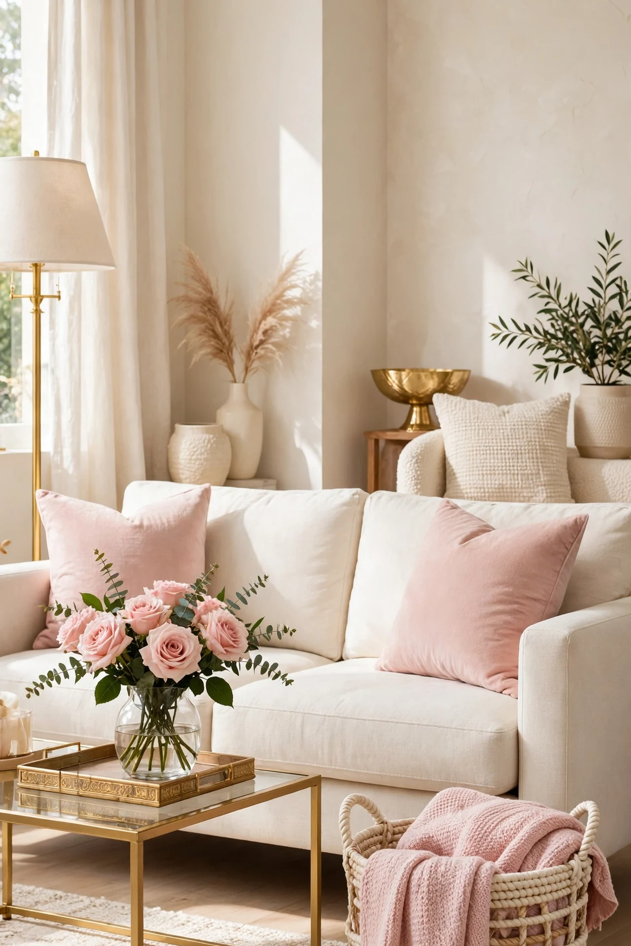
Here is the rule quietly running under every coordinated saved room: the accent color appears exactly three times, spread across the room. Once is an accident, twice is a coincidence, three times is a decision. In this room the accent is blush, on the sofa cushions, in the roses on the coffee table tray, and in one throw folded in the basket, a triangle of soft pink that ties three zones together without ever shouting.
The spacing matters more than the shade. The three repeats should sit far enough apart that the eye travels between them, near corner, center, and far corner is ideal, and they should be similar in weight so no single one dominates. When the three are in place, stop. A fourth and fifth repeat tip the room from styled to themed, which is why the rule has a number.
How to do it: Choose your accent from something you already own and like, a cushion color, an art tone, a favorite flower. Place the largest repeat first, usually the cushions, then the smallest, flowers or a candle, then the middle one to complete the triangle. Live with it a day, then check from the doorway that your eye moves around the room instead of landing once. Change the accent with covers and flowers when you want a new season, keeping the three-count rule. Pro Tip: This is the fastest rescue for a room that feels random. Before buying anything, count your current accents; most rooms have one color appearing once, and two cheap repeats fix it. Common mistake: Three repeats all on the same wall or piece of furniture. That reads as one big block of color, not a thread through the room.
13. Use a Stack of Books as a Pedestal
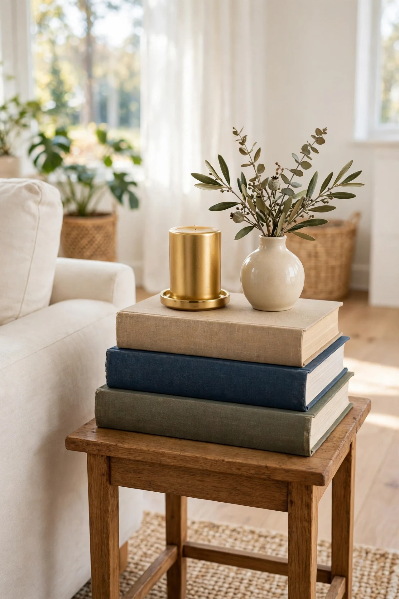
The humblest move on the boards is a stack of books used as a small stage. Stylists put books under everything, candles, vases, small plants, a bowl, because height is what separates a placed object from a lost one. A candle sitting directly on a side table is an item; the same candle on a stack of two books is a vignette, and the camera knows the difference instantly.
The stack itself is styled: two or three large hardcovers, aligned neatly or turned a few degrees, in covers that suit the palette. Coffee table books are made for this, but any large hardcover works, including ones turned spine-in or wrapped in plain paper when their covers fight the room. The object on top should be single and slightly smaller than the top book, so the stack reads as its pedestal, not its competitor.
How to do it: Choose two or three books of descending size and stack them where a surface feels flat, the side table, the console, the shelf, inside the tray. Place one object on top, and resist adding a second. Keep one stack per surface at most; two stacks on one table start a library, not a vignette. Dust the stack when you dust the table, lifting the object, not the books, so the arrangement survives cleaning. Pro Tip: Thrift stores and library sales are the classic source for large, calm-covered hardcovers; buy them by size and cover color, guilt free. Common mistake: A tall wobbling tower of paperbacks. The pedestal works because it is low, wide, and steady; three books is plenty.
14. Hang One Oversized Art Piece Above the Sofa
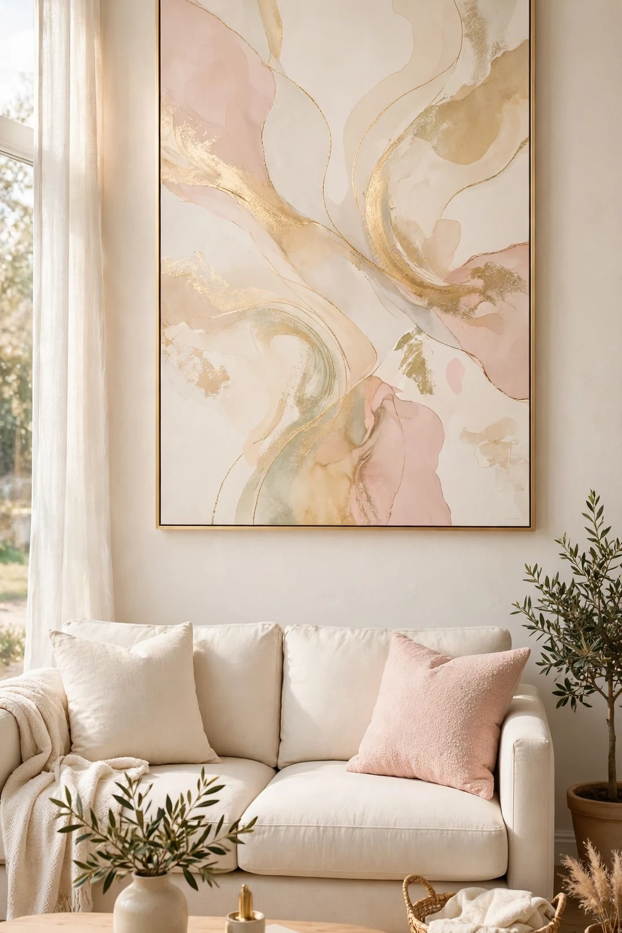
The alternative to the gallery wall, and just as saved, is one very large piece above the sofa. A single oversized artwork gives the room a crown in one move: no arrangement to plan, no gaps to measure, and a calm that suits rooms where the rest of the styling is busy. Soft abstracts in the room’s palette, cream, blush, taupe, a wash of gold, are the board favorites because they add tone without adding a subject to compete with the room.
Scale is the entire secret and the usual failure. The piece should span roughly two thirds of the sofa’s width and hang with its bottom edge a hand’s span or so above the sofa back, close enough to belong to the furniture. Most people hang art too small and too high, which is why their rooms never match the photos; the saved rooms are simply braver about size and lower about placement.
How to do it: Measure the sofa and choose a piece about two thirds as wide; a large canvas or framed print you own in another room is the free first try. Hang it centered on the sofa, not on the wall, if the two differ. If one large piece is not in reach, hang two matching frames tight together so they read as one wide piece, or stretch a plain woven textile panel on a simple frame for texture instead of image. Pro Tip: Art with a lot of pale space inside it suits this spot best; the sofa wall stays calm even at large size. Common mistake: A small frame alone above a wide sofa. It cannot hold the wall, and every other good move in the room looks unfinished beneath it.
15. Set a Small Side Table Moment Beside the Sofa
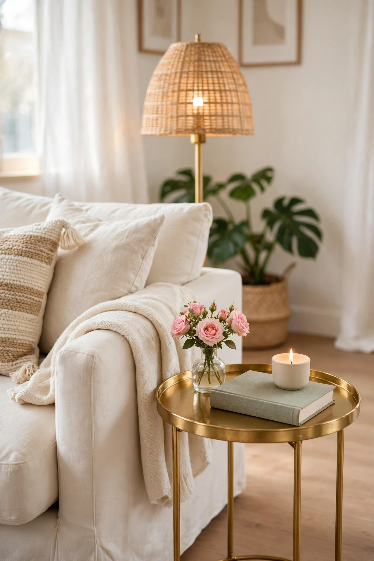
The boards are full of these: the little styled moment at the sofa’s side, a small table holding a lamp, one book, and one pretty thing. It is the room’s smallest vignette and one of its hardest working, because the side table is where real life lands, drinks, remotes, glasses, and the styling has to survive being used every single evening.
The formula protects itself by leaving room. Lamp at the back, book flat as the base layer, one object, a tiny vase, a candle, a small dish for the remote, and a clear space at the front edge for a cup. That empty front edge is the design’s honesty: a side table with nowhere to put a drink will be rearranged by life within a day, usually badly.
How to do it: Choose a table at sofa-arm height, round if the room is full of straight lines. Place the lamp first at the back, then the book, then the single object, and check that a cup still fits at the front. Keep the object inside the accent rule, blush or gold here, so the moment joins the room’s triangle of repeats. Reset it in ten seconds nightly as part of the room’s wind-down. Pro Tip: A small dish on the table earns its place by holding the remote and glasses; a beautiful container for an ugly necessity is the oldest stylist trick there is. Common mistake: Styling the side table like a display shelf with no working space. The first drink of the evening will demolish it, and demolished styling never gets rebuilt.
16. Drape a Throw the Stylist Way
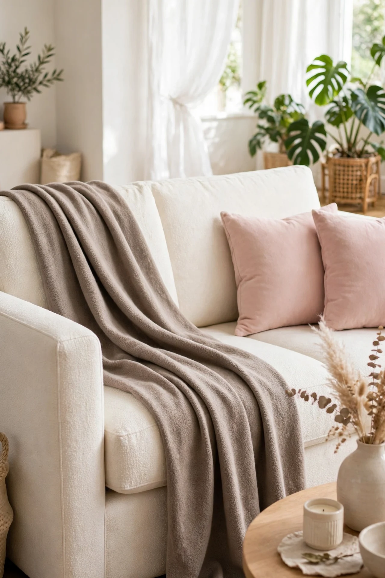
A throw can be folded like laundry or draped like a stylist, and the saved photos always choose the drape. The classic version: the throw gathered loosely, laid over one sofa arm or corner, and allowed to fall in a soft diagonal cascade onto the seat, with its edge and fringe showing. It reads as relaxed luxury, a room arranged a moment ago by someone with taste, rather than a room tidied for inspection.
The drape is a skill of about four seconds once you know it. The secret is to work with the fabric’s fall instead of folding against it: hold the throw by one short edge, let it gather naturally in your hand, and lay it so the gathered end sits on the arm and the rest spills down in folds. One cushion placed partly over the top end anchors it and makes the whole thing look intentional.
How to do it: Choose the room’s best throw, the one with texture or a fringed edge, in taupe or cream. Drape it over the arm nearest the lamp, let it cascade onto the seat corner, and set one cushion over its top edge. Leave the folds uneven on purpose; perfect symmetry kills the effect. Re-drape after use rather than folding it away, since the drape is the throw’s daytime job. Pro Tip: A throw with two different sides, woven on one, smooth on the other, gives you two looks; turn it with the seasons. Common mistake: Spreading the throw flat across the whole sofa back like a blanket on a bed. Flat and wide reads as covering something up; gathered and falling reads as style.
17. Put Tall Stems in a Tall Vase
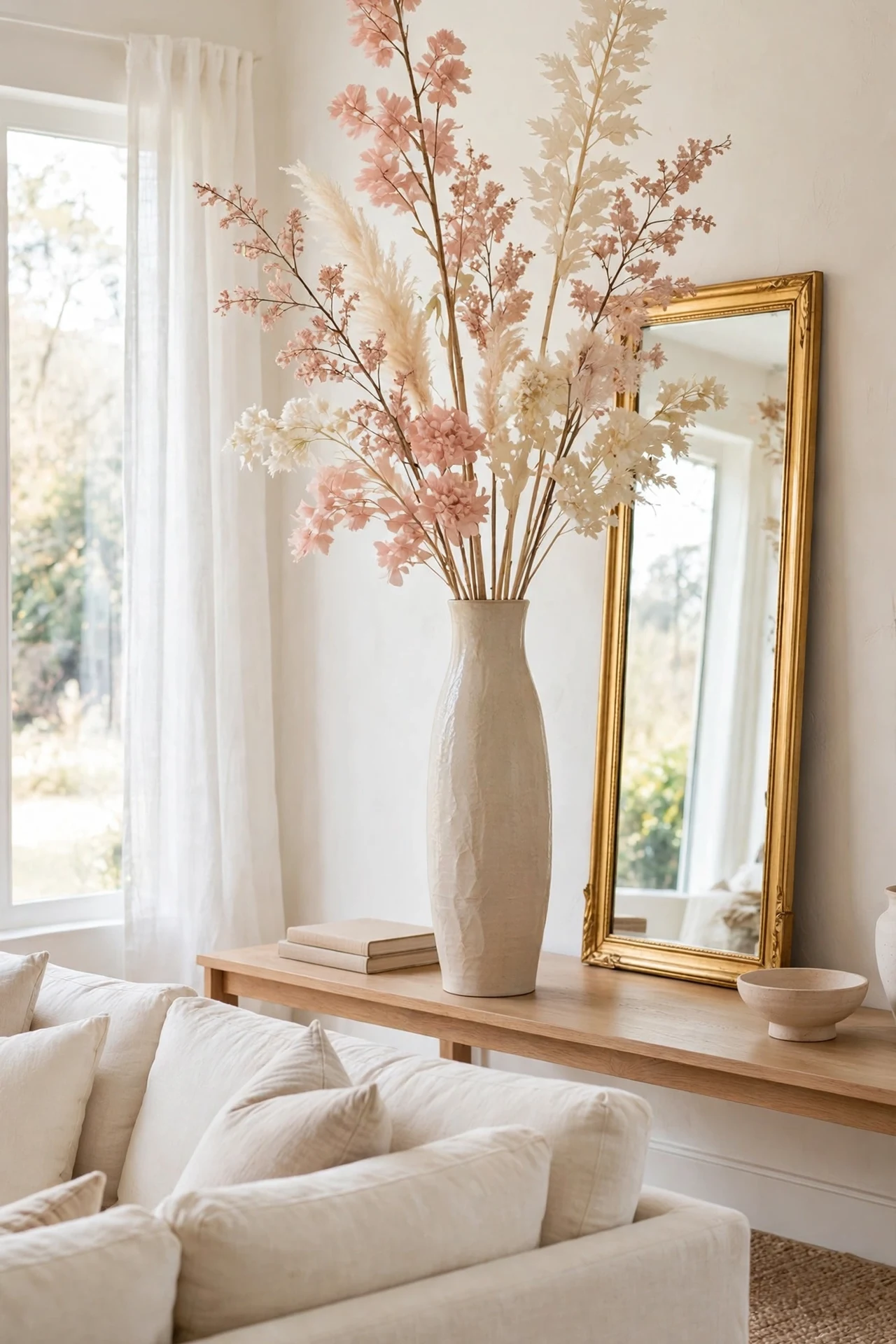
Height is the dimension most rooms forget, and the saved photos never do. A tall vase with tall stems, pampas-style plumes, branches, or long-stemmed faux roses, placed on a console, a mantel, or the floor beside the plant corner, draws the eye up and gives the room the vertical grace that low furniture cannot. In a glam palette the stems stay soft: blush, cream, and dried natural tones, nothing bright, nothing shiny.
The vase should be worthy of the stems: a tall ceramic or glass vessel with some weight, since a light vase under tall stems is a tipping risk and looks nervous besides. The arrangement rule is loose and airy, stems at slightly different heights with space between them, echoing the one-branch calm applied at living-room scale. Faux stems earn their keep here; tall fresh arrangements are costly to maintain, and good faux reads perfectly at room distance.
How to do it: Place the vase where the room needs height, usually the console behind the sofa, the mantel, or a bare corner opposite the plant corner so the two verticals balance. Add stems a few at a time, tallest in the middle, until the arrangement has air between the heads. Keep the total height below anything fragile above it, and anchor a floor vase with weight in its base if children or pets pass close. Pro Tip: One stem type, repeated, looks expensive; three stem types mixed look like leftovers. Choose the single best and buy enough of it. Common mistake: Stems too short for the vase, disappearing into its neck. Stems should rise well clear of the rim, roughly as much above as the vase is tall.
18. Keep Every Surface Half Empty
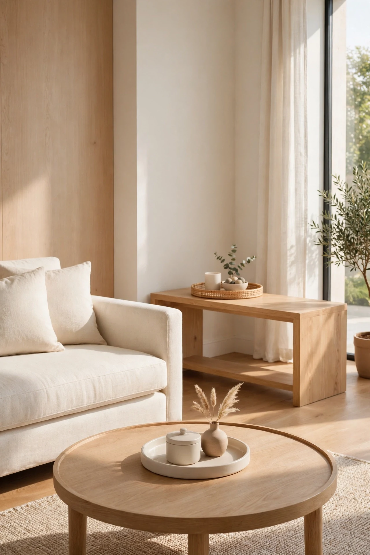
Underneath every other idea on this list sits one discipline: the surfaces stay half empty. Saved rooms look calm because half of every console, shelf, and table is simply bare, and the styled groups glow against that emptiness. Most real rooms fail the photos not because their objects are wrong but because their objects never stop; every surface is filled edge to edge, so nothing reads as chosen.
Half empty is a measurable rule, which is why it works. Look at each surface and ask whether you could set down a tray across half of it. If not, something leaves, to a drawer, a basket, or another room. The objects that remain should be the group’s best: the tray, the book stack, the vase. Everything that was only there because the surface existed goes, and it is rarely missed after a week.
How to do it: Take one surface at a time, empty it completely, and return only the planned group from this list, the tray, the stack, the moment. Photograph it; that photograph becomes the surface’s reset picture for the day clutter creeps back. Give homeless items honest homes in closed storage, since objects without homes always return to surfaces. Repeat monthly in a five minute pass; half empty is a habit, not an event. Pro Tip: The doorway test settles arguments. Stand at the door and squint; surfaces that still look full at a squint are not half empty yet. Common mistake: Rearranging the same number of objects more neatly. Neat clutter is still clutter; the count, not the arrangement, is what changes the photograph.
19. Finish With One Scent and a Nightly Reset
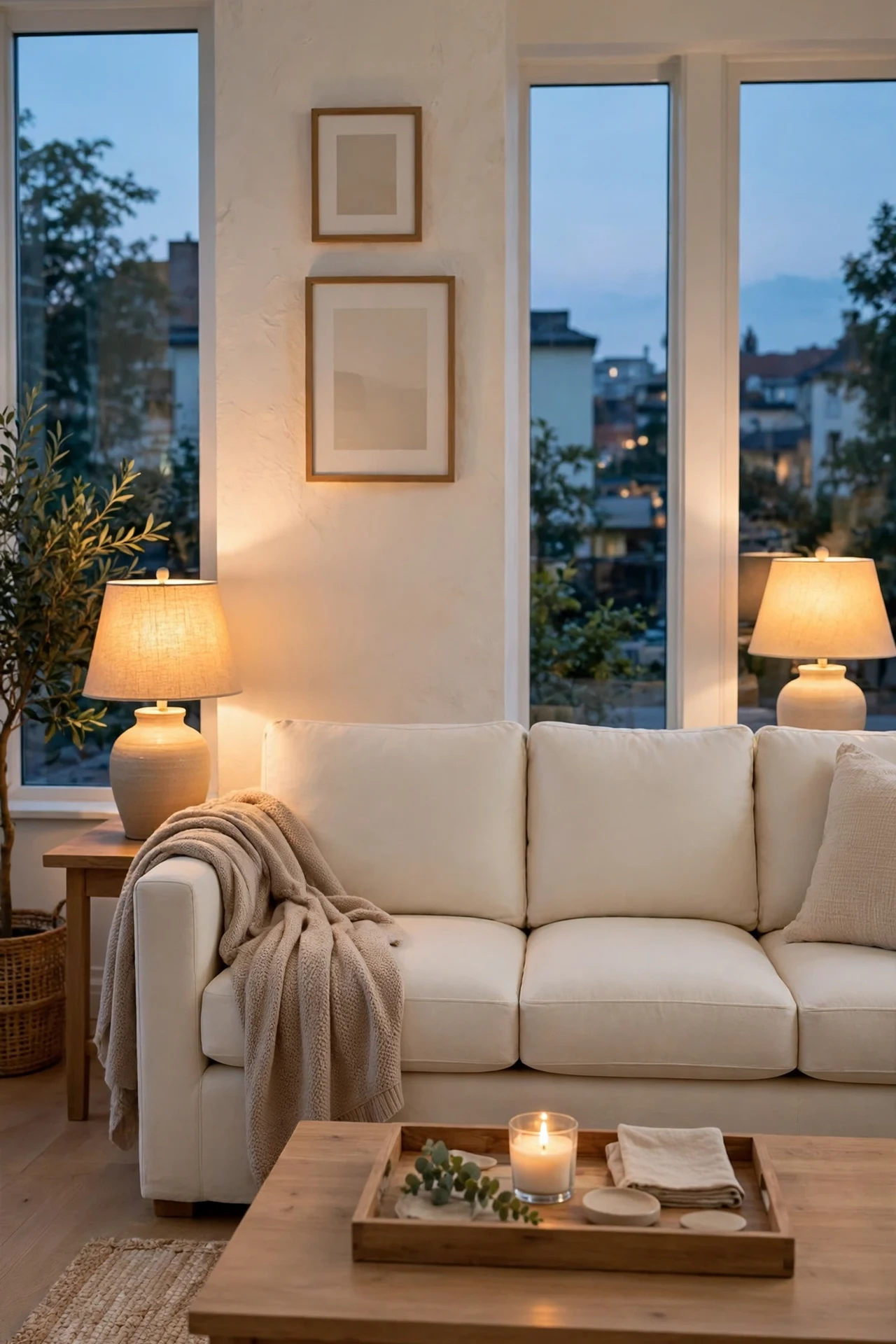
The last saved move is invisible in the photo and present in all of them: the room smells like one thing, and it was reset the night before. A single candle on the coffee table tray, lit in the evening, gives the room a signature scent the way hotels use one scent per space. And the five minute nightly reset, cushions plumped, throw re-draped, tray group straightened, surfaces back to half empty, is what keeps eighteen ideas alive on an ordinary Tuesday.
Neither half of this idea costs anything meaningful. One scent means choosing one candle or diffuser for the room and removing the competing sprays and plug-ins that make real rooms smell like a shop. The reset survives because it is short and fixed: the same small circuit every night, sofa to tables to shelves, ending with the candle lit or blown out as the full stop.
How to do it: Choose one calm scent for the living room and place its single source on the coffee table tray or the console, on a coaster, lit only while someone is in the room. Then set the reset order: plump and re-formula the cushions, re-drape the throw, straighten the tray, return strays to their homes, and check the surfaces against their reset photographs. End at the doorway for the five second view; whatever catches the eye is tomorrow’s first small fix. Pro Tip: Pair the reset with the lamps; turn off the ceiling light when you start and reset by lamplight, and the chore becomes the calmest five minutes of the evening. Common mistake: Resetting weekly in one big tidy. An hour feels like punishment and gets skipped; five minutes nightly is the whole system that keeps a Pinterest room real.
Quick Reference Table
| Idea | What It Adds | Key Rule |
|---|---|---|
| Layered textiles | A styled, soft sofa | Three layers, one palette |
| High wide curtains | Taller windows and walls | Ceiling to floor, wider than frame |
| Gallery wall | One calm wall block | One frame color, sofa-width block |
| Leaning mirror | Doubled light and height | Face the window, strap it safely |
| Coffee table tray | A border for styling | Three heights inside one tray |
| Plant corner | A living green triangle | Odd numbers, three heights |
| Layered light | Evening glow | Three heights, all warm white |
| Cushion formula | A finished formal sofa | Two, two, and one lumbar |
| Throw basket | Reachable coziness | Folded edges showing, beside sofa |
| Rug that reaches | One furniture island | Front legs of every seat on it |
| Shelves by thirds | Calm open storage | One third of every shelf empty |
| Accent three times | A color thread | Three repeats, spread apart |
| Book stack pedestal | Height for small objects | Two or three books, one object |
| Oversized art | A crown for the sofa | Two thirds of sofa width, hung low |
| Side table moment | A working vignette | Lamp, book, one object, cup space |
| Styled throw drape | Relaxed luxury | Gathered cascade, cushion anchored |
| Tall stems | Vertical grace | One stem type, airy and tall |
| Half empty surfaces | Calm everywhere | Half of every surface bare |
| Scent and reset | A room that lasts | One scent, five minutes nightly |
The Pinterest Room Checklist
- Sofa textiles layered three deep in one palette
- Curtains hung at the ceiling, wide, and touching the floor
- Gallery wall in one frame color, sized to the sofa
- Mirror leaning safely, reflecting light or greenery
- Coffee table held by one tray with three heights
- Plant corner grouped in odd numbers at three heights
- Light layered at three heights, all warm white
- Cushions in the two-two-one formula or loose layers
- Woven basket of throws beside the sofa
- Rug reaches under the front legs of every seat
- Every open shelf has one empty third
- Accent color repeated exactly three times
- Book stacks used as pedestals, three books or fewer
- Art above the sofa is two thirds of its width
- Side table moment leaves space for a cup
- Throw draped in a cascade, not spread flat
- Tall stems rise well clear of their vase
- Every surface passes the half empty test
- One scent only, and the reset done tonight
Frequently Asked Questions
I cannot do all nineteen. Which Pinterest decor moves matter most?
Start with the five that change photographs: curtains hung high and to the floor, a rug that reaches the furniture, textiles layered on the sofa, one tray on the coffee table, and surfaces edited to half empty. Those five cost the least, need no new furniture, and together they produce most of the gap between an ordinary room and a saved one. Add the mirror, the plant corner, and the accent rule when you are ready for more.
How do I copy Pinterest rooms without my home looking like a copy?
Copy the moves, not the objects. The moves are universal, layering, grouping, repeating one color, sizing art to furniture, while the objects should be yours, your books, your frames, your grandmother’s bowl on the book stack. A room built from the moves and filled with your own things reads as styled, not staged, and it is the version that survives real life.
My living room is small. Which of these ideas still work?
Nearly all of them, and several work harder in small rooms. A big rug makes a small room read larger, a leaning mirror doubles its light, half empty surfaces return visual space, and curtains at the ceiling add height. Scale down the counts, not the rules: two plants instead of three in the corner is fine, but keep the heights different, and let the gallery wall be four frames instead of six, still in one frame color.
How much of this is renter-friendly?
Most of it. Cushions, throws, baskets, trays, book stacks, plants, lamps, rugs, and the mirror’s lean all move out with you, and the mirror needs only a small top fixing that picture strips or a single filled hole usually covers. Curtain rods and gallery walls depend on your lease; many landlords allow picture holes, and removable strips handle light frames. Paint and hardwired lighting are the only moves on this list that normally need written permission first.
Conclusion
A Pinterest room is not a shopping list; it is nineteen small disciplines done together: textiles in layers, curtains at the ceiling, one frame color, a mirror that earns its lean, a tray with a border, plants in a triangle, light in layers, one color repeated three times, surfaces kept half empty, and five quiet minutes each night to hold it all in place. Pick the five that fix what bothers you most, live with them for a week, and then notice how often your own room starts to look like the photos you saved.